Lakore
Naming and brand identity
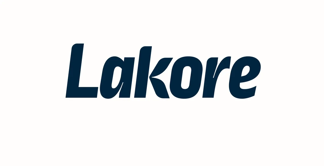
Lakore is a music school that had been running for years, with an image that had aged to the point of making the place feel a little sad. This was not a refresh: new name, new image, all of it. And not for the school alone, since the brand also had to cover the shop, the studios and the label.
- Client
- Lakore
- Role
- Naming and brand identity
- Year
- 2025
The school was changing hands, and the new owner was taking over a long-established place. The building and the organisation were being renewed, and the image had to move at the same moment, or the change would only have been visible from the inside. The difficulty was the double audience: the brand had to appeal to the children walking in and reassure the parents signing them up, without siding with either.
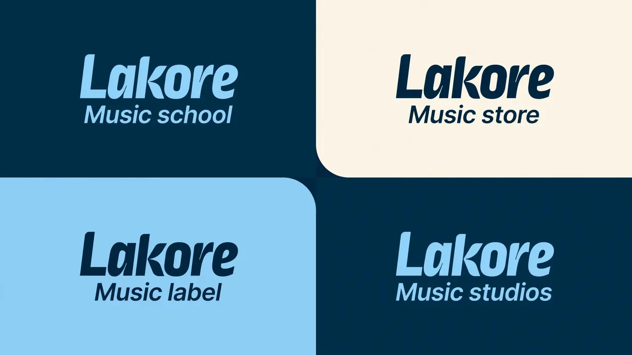
One brand, four entities
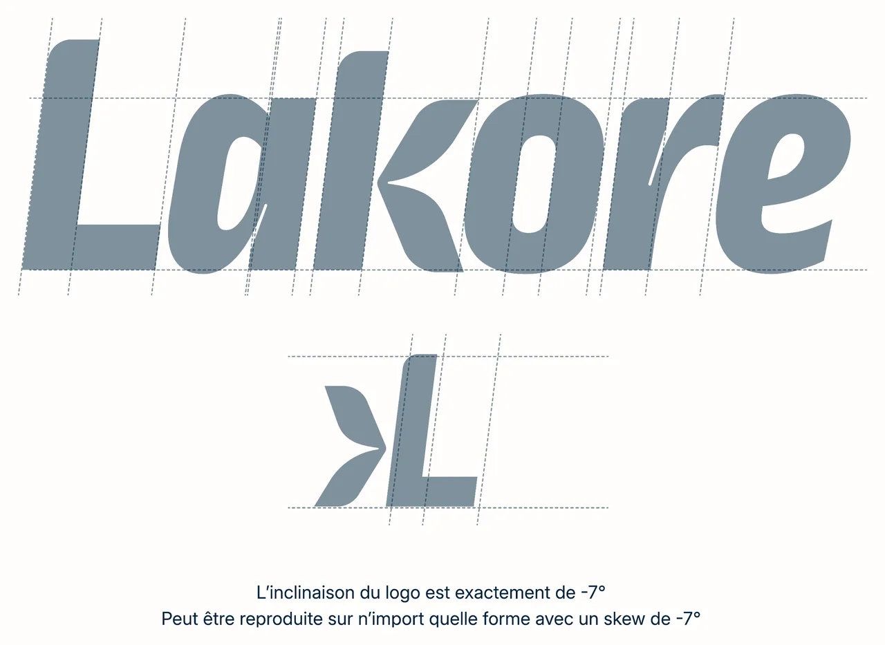
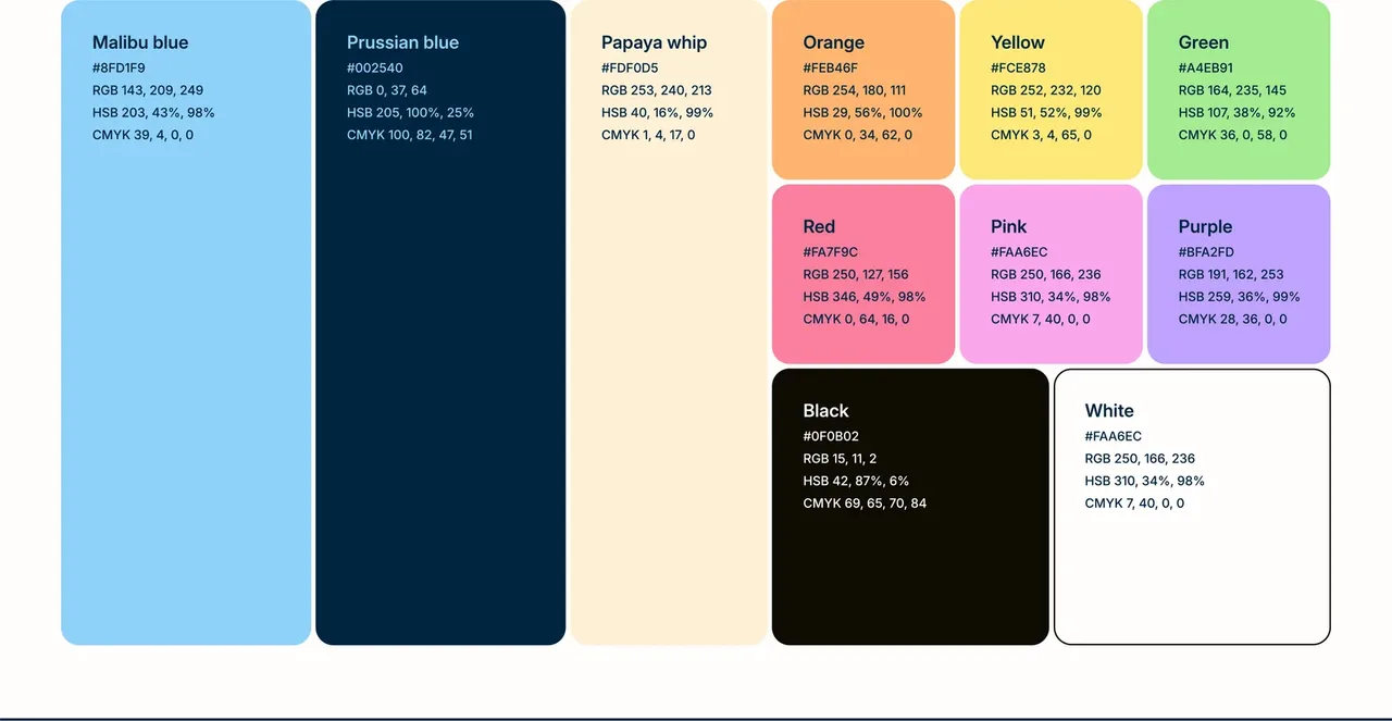
The logo comes with four baselines, one per activity: Music school, Music store, Music studios, Music label. Same structure, same spirit, only the field changes, which identifies each world without having to build four brands. The mark also carries one simple, repeatable rule: a tilt of exactly -7 degrees, applicable to any shape in the system. On colour, a trio of primaries holds most of the output, Malibu blue, Prussian blue and Papaya whip beige; the bright tones are accents only, on a sticker, a word, a detail.
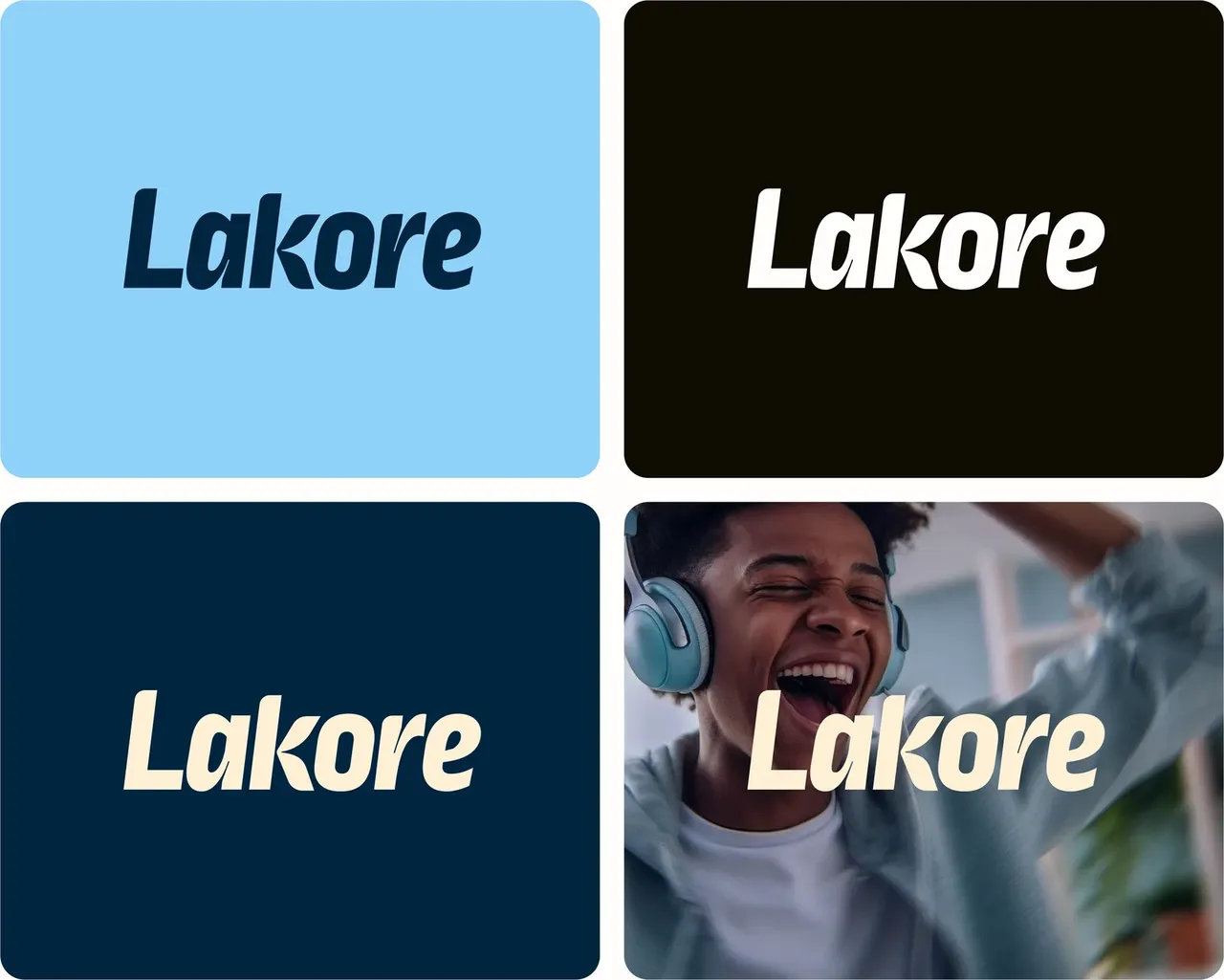
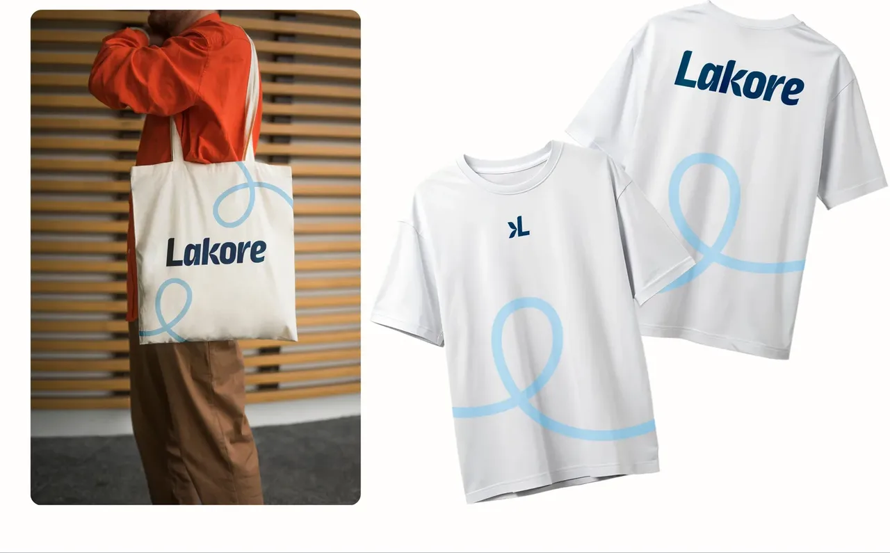
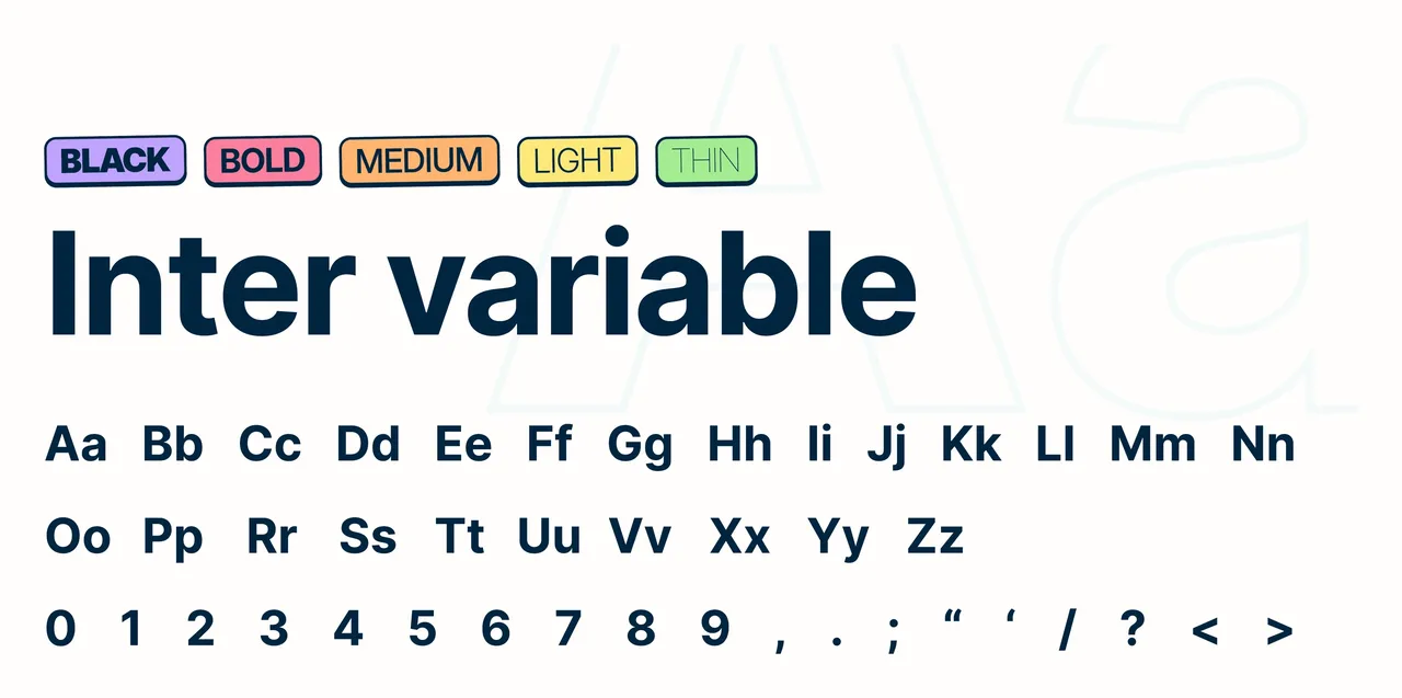
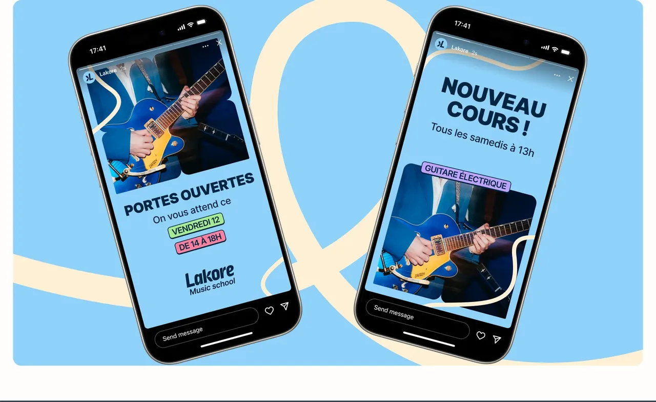
The system proves itself on the objects rather than on the board: textiles, stories, the things lying around the shop. Four entities living side by side without blurring is a constant test, and the tilt rule is what holds it together without reopening a decision for every new piece. A music school turns out a lot of small items over a year. They have to be quick to make and still land right.
What the brand covers
- entities under a single brand: school, store, studios and label
- 4
- pages of brand guidelines
- 27
- printed items: cards, flyers, poster and A-board
- 4
Counted on 28/09/2026 in the project files
Before, during, after: the same method on every project
See our expertise · Art Direction, Branding & Naming Let's talk about your project- Before
Discovery
We get to know the project, ask our questions and talk it through with you.
- Before
Inspiration and direction
We gather inspiration and set a direction with you, before anything gets created.
- During
Creation
The heart of the project, paced by regular back and forth with you.
- After
Delivery and testing
We deliver, then check with you that everything works.
- After
Handover and adjustments
We train you and help you get to grips with the material. Your feedback is taken on board to fine-tune it.