Our projects.
A selection of branding, creative web and art-direction projects.
Azzato
Website, catalogue and online tools
Azzato has been selling, renting and repairing instruments in Brussels and Louvain-la-Neuve since 1919. The project replaced the old site with a full catalogue, wired to the shop's management software, and with three tools that each answer one specific question before the visit.
Spread.it
Brand identity redesign and system
Spread.it is a digital communications agency. Its logo already worked: the idea was sound, the mark memorable. What went wrong was in the execution, a rectangle too thin, lettering pushed too far right, an overall balance that made the brand unreadable as soon as it shrank. The brief was therefore not to invent a brand, but to repair the one that existed and open up the whole system around it.
Vertical View
Brand identity and website
Vertical View is David Dieu's vertical video production company. The format is the job: videos made for the screen you hold in your hand, shot and delivered fast. The brand had to fit inside an icon, a mark that is both the V of Vertical View and a bounce, because the icon was the part that would end up everywhere, right down to the shooting jackets.
Mine Madeh
Brand identity redesign
Mine Madeh is a Syrian restaurant in central Brussels. It already existed, with an image that was no longer doing it any favours. So the rebrand did not start from a blank page: keep what the regulars recognised, and lift everything else a notch.
Parko Studio
Brand identity and website
Parko is two things at once: a production company, and a large photo studio in Wavre open to every kind of project, run by Marco. A single brand could not hold both without crushing one of them. So the project produced a pair: a logo for the production side, a mascot for the place.
Booza!
Brand identity
Booza is a Syrian coffee house in Ixelles, signed Baghdi Sar: a place for coffee, tea and pastries. Its name comes from booza, the Syrian pistachio ice cream that is the house speciality. The identity had to carry that busy-room energy rather than the hush of a tearoom, and make people want to walk in before they had read the menu.
Vallée du Ciel
Name, brand identity, menus and website
The old Romanian restaurant in central Brussels has its regulars and it works very well. What had aged was its image, and its name. So the project started by renaming it, then remade everything you can see: the lettering, the menus, the site.
Hockey Wallonie Bruxelles
Motion design
Motion design and graphic titling for a Hockey Wallonie Bruxelles video. A mix of live footage, interviews and data animations to bring their communication to life.
Krefel
Product motion design
Motion design and product titling for Krefel. 3D advertising renders and packaging animation for social media.
Lakore
Naming and brand identity
Lakore is a music school that had been running for years, with an image that had aged to the point of making the place feel a little sad. This was not a refresh: new name, new image, all of it. And not for the school alone, since the brand also had to cover the shop, the studios and the label.
Plez
Brand identity and graphic system
Plez is a video studio that supports creative ideas from the first brief to the final cut, and produces its own podcast. Designing the identity of a creative studio means working for a client who knows exactly what they are looking at. What was needed was not a logo but a language: a way to name the stages of a project, dress each one, and hold up across every medium the studio uses.
Miam
Brand identity
Miam! Burger is a Brussels burger brand launched by Brussels creator Vidal (@vidalalexe), followed by more than 500,000 people on TikTok. The audience existed before the shop did, and it lives on social media: the brand had to be recognisable at thumbnail size, at the speed of a scrolling thumb. Hence the round, generous shapes, an exclamation mark doing all the attitude work, and pop colours with no half measures. The 2025 brand book holds it together, from the drawing of the logo to photo direction.
Wagas
Brand identity and website
Wagas is a competition: you take your chance on a prize, and a charity benefits. The brand puts it in one line, play to win, play to help. Two promises in the same gesture, one very concrete and the other more distant, which had to be connected in the imagery without the second one sounding like a sales argument.
Manor Belgium
Brand identity
Manor Belgium is a Belgian house of home-care products founded by Lucile Rochelet-de Galard. She was looking for a washing-up liquid with a natural formula, Belgian, and good-looking enough to stay out on the counter. It did not exist, so she made it. Three probiotic products in glass bottles: the brand had to hold heritage and modern efficacy together.
Artisanat de Saba
Brand identity
Artisanat de Saba is a brand of Ethiopian artisanal products: oils, spices, tea, honey. It had to hold two promises at once, rarity and authenticity on one side, a quiet elegance on the other, without ever falling into decorative exoticism. The principle is set on the first page of the brand book: luxury and tradition are not opposites, they meet in selection, precision and sincerity.
Georges Baghdi Sar
Interactive press kit
Georges Baghdi Sar is a Syrian chef who came to Belgium as a child. His press kit is not a download, it is a walk-through: instead of a biography PDF, a site that tells his path and lets the press speak after him.
Contact Max
Brand identity
Contact Max is a new radio station in the Radio Contact group, at RTL Belgium. The constraint fitted in one sentence: the logo had to work inside a brand universe that already existed. Not build a new one beside it, and not dissolve into it either.
David Dieu
Website
David Dieu is a content creator, and his site does not speak to his audience: it speaks to the brands that want to work with him. That changes everything. The page does not show videos, it shows what the videos produced.
Simon Tarea
Website and search
Simon Tarea coaches entrepreneurs worn out by their own pace, often highly sensitive or gifted. His site speaks to someone who is tired and has no energy left to go looking. So the home page reads like a conversation: first recognise yourself, then understand, then book a call.
Jill: Press Kits & Halloween
Motion design titling
Motion design titling for Jill's "Dossiers de Silent" and Halloween special formats. Animated title cards, lower-thirds and transition stingers for a mystery/thriller mood.
Radio Contact: Kallax
Show titling
Motion design for "Quitte ou Double", a Radio Contact (RTL) game format. Kinetic typography titling and animation of the Kallax-shelf-style game grid.
RTL: Co-production Titles
Opening titles
Opening title sequence for RTL co-productions. Logo animation and clean graphic titling to identify co-produced shows.
bel RTL: Summer 2025
Campaign titling
Motion design titling for the "bel RTL fait…" summer 2025 campaign. Logo animation and summer visual identity for the radio station.
Casa for Life
CMS-based website
Casa for Life is a Belgian association supporting health and life in Casamance, Senegal. One of the studio's earliest projects, with a simple brief: a site the association can maintain itself, without going back to a supplier for every new mission.
RTL, show press kits
Design and development of the press kits
A show's press kit does not have to be a PDF. These sites exist to make you discover the show, not to archive it: you step inside, you see the set, you play the trailer, you read the interview. A single engine produces every kit, each with its own dressing.
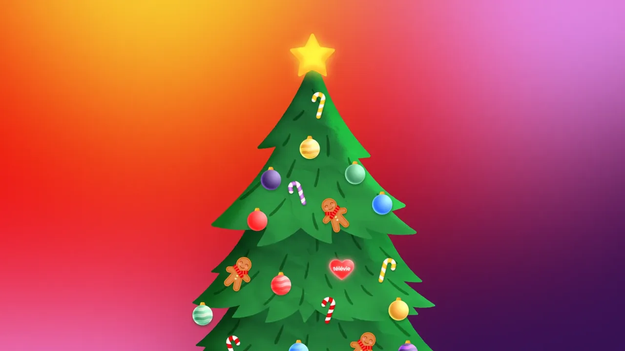
Télévie, websites for giving
Design and development of the Télévie websites
Télévie raises funds for cancer research. These websites turn a small gesture from the public into real support: hanging a decoration on a giant Christmas tree by making a donation, or leaving a kind word. The Télévie Christmas tree is the centrepiece.
Niaj (Namur Is A Joke)
Social video content
Video content for Niaj (Namur Is A Joke). Teaser, interview and vox-pop shot and edited for social media, vertical format.
Carlsberg 0.0 Hockey League
Social media art direction and post templates
Social media art direction for the Carlsberg 0.0 Hockey League, the Belgian hockey league. A direction strong enough to reach people who do not follow hockey, turned into templates the teams fill in every week.
No project matches your search.
FAQ.
Everything you need to know before contacting us.
Four stages, the same for an identity, a website or a film: discovery, direction, framing, production and delivery. What each one holds depends on the craft, and the detail lives on the page of the expertise concerned.
Each project is unique. Full branding typically takes 6-8 weeks, while a custom website requires 8-14 weeks depending on complexity.
Yes, we adapt our approach to your budget while maintaining our quality standards. We offer modular solutions that can evolve over time.
A team that scales with the brief. The design work stays with us, and we bring in specialists depending on what the project needs. For sound, voice, music or photography, we would rather point you to people whose craft it is than do it halfway.
Yes. Every site we deliver comes with its own back office: your texts, your images and your pages can be changed from your browser, without going through us and without touching any code.
Yes, size is not the criterion: a logo, a short film or a single page suit us fine. What we turn down are tasks with no creative stake, the ones where there is nothing to design.