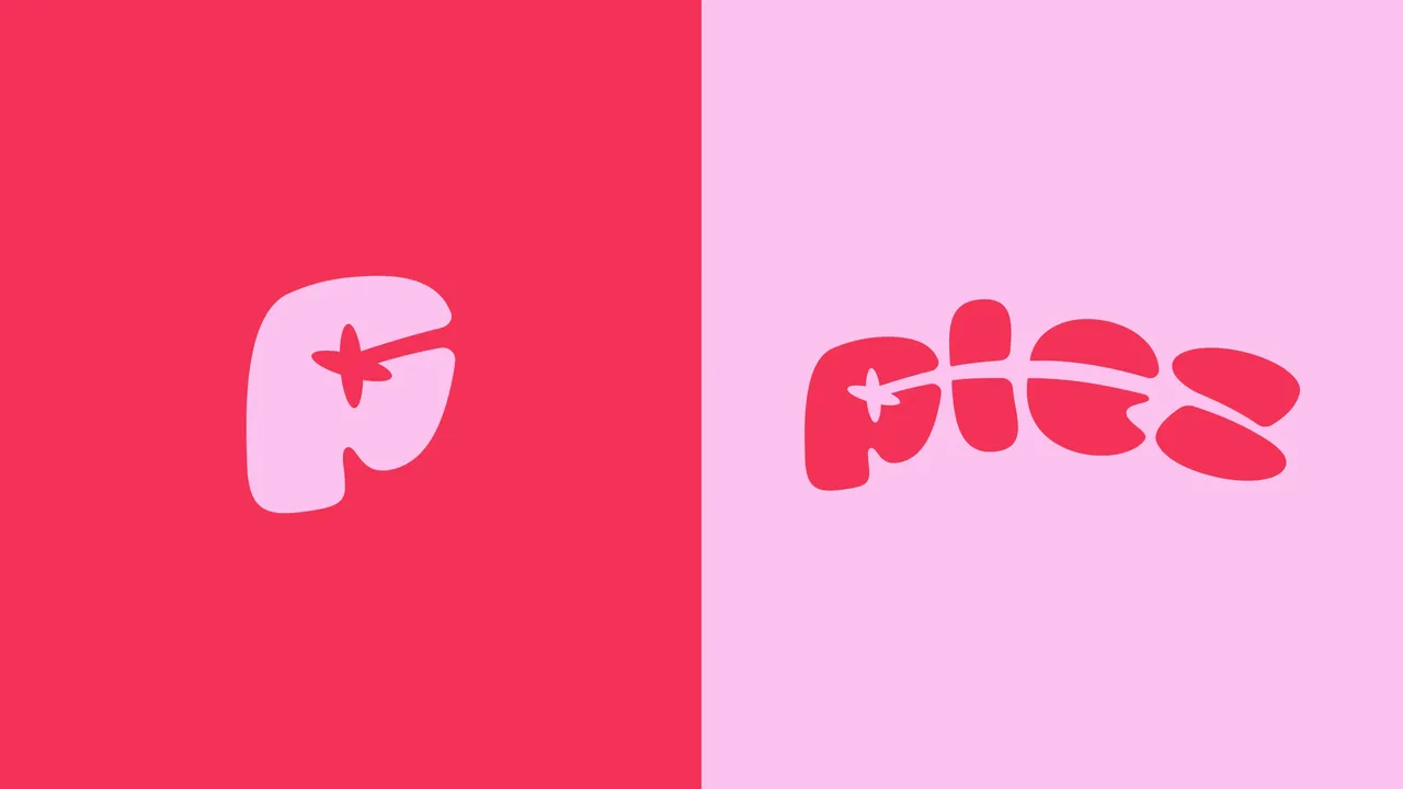
Plez is a video studio that supports creative ideas from the first brief to the final cut, and produces its own podcast. Designing the identity of a creative studio means working for a client who knows exactly what they are looking at. What was needed was not a logo but a language: a way to name the stages of a project, dress each one, and hold up across every medium the studio uses.
- Client
- Plez
- Role
- Brand identity and graphic system
- Year
- 2024
- Tools
- Figma, Illustrator, Photoshop, Procreate
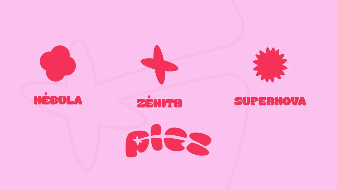
Nébula, Zénit, Supernova: three moments, three systems
This is the most singular part of the system. Every creative project goes through three moments, and each one gets its own shape, colour and name, borrowed from the vocabulary of stars. Nébula is the intake: the blurred zone of inspiration, where potential mixes without definite form, waiting to find its centre of gravity. Zénit is the creative and support phase, the peak of a star's brightness, when ambition reaches its height. Supernova is the delivery: the explosion that marks the end, scatters its energy and leaves a legacy. The studio therefore has more than a style guide. It has a language to say where a project stands, and a ready-made look for each of those moments.
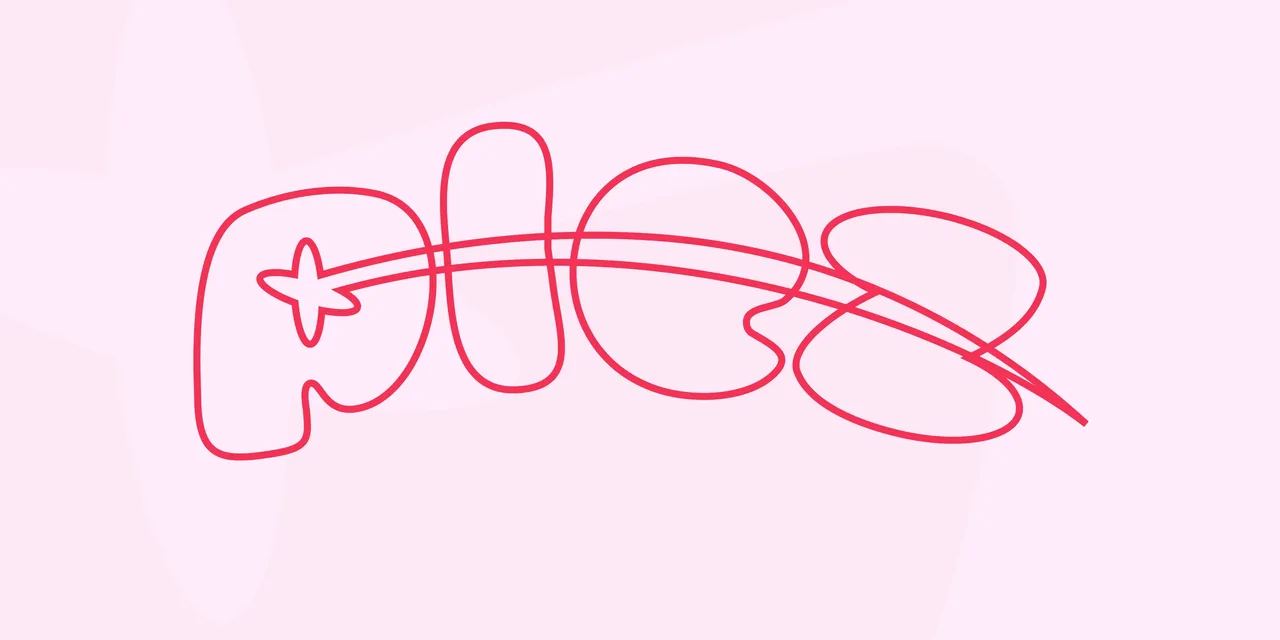
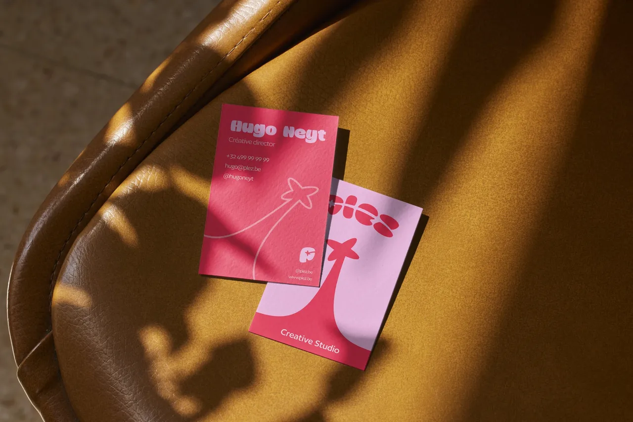
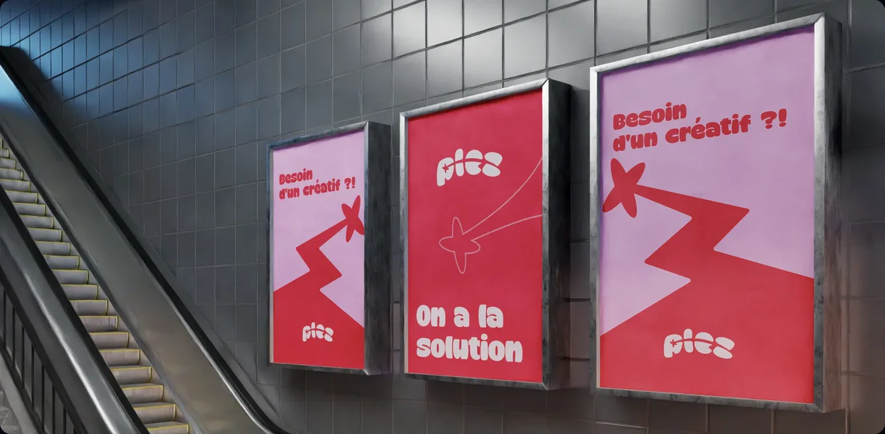
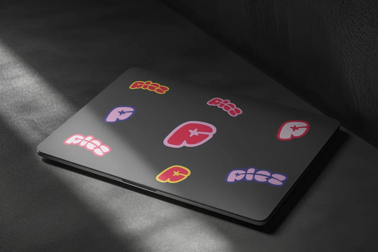
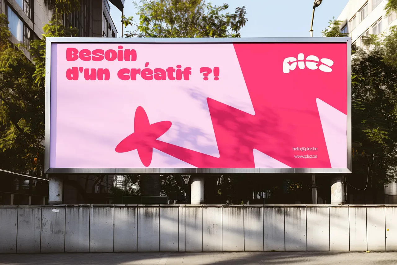
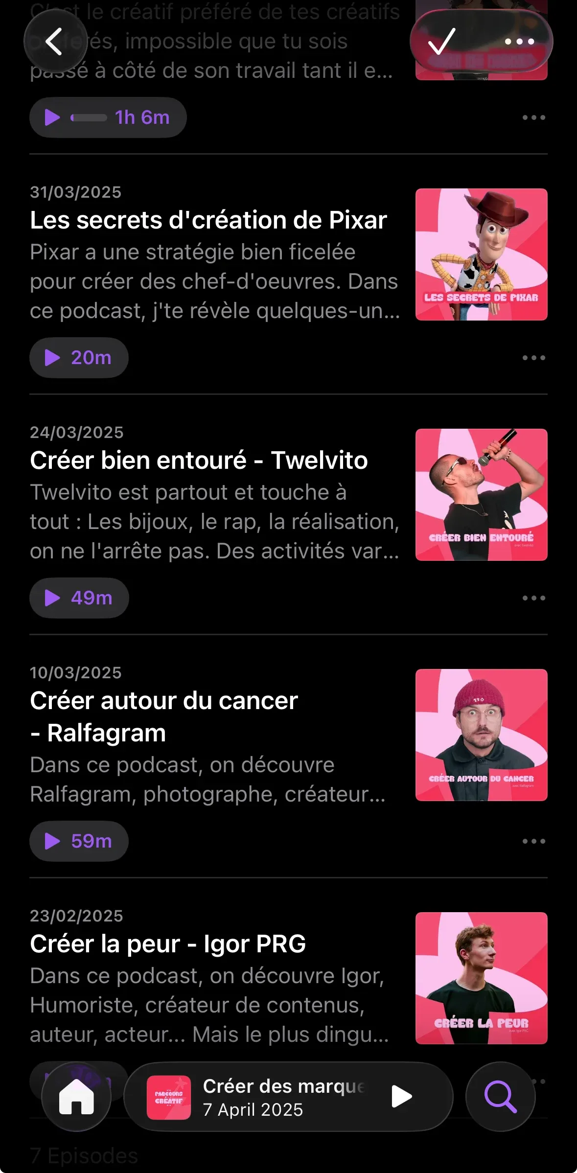
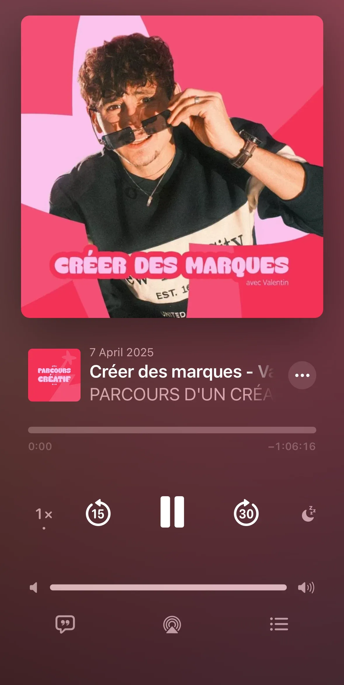
The language proves itself on the studio's own material: cards, large-format posters, a metro station, a laptop screen. Each moment keeps its shape and colour from one surface to the next, so a piece can be placed at a glance without reading its title. The podcast is the most demanding case, because it ships regularly and carries its own episodes: it gets its own styling and player, built from the same parts as everything else, which avoids inventing a parallel identity for a recurring format.
The language in numbers
- pages of brand book
- 40
- project stages named and designed: Nébula, Zénit, Supernova
- 3
Counted on 28/09/2026 in the project files
Listen to the podcast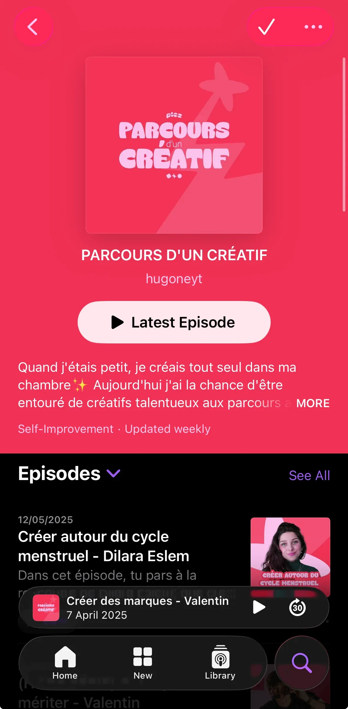

Before, during, after: the same method on every project
See our expertise · Art Direction, Branding & Naming Let's talk about your project- Before
Discovery
We get to know the project, ask our questions and talk it through with you.
- Before
Inspiration and direction
We gather inspiration and set a direction with you, before anything gets created.
- During
Creation
The heart of the project, paced by regular back and forth with you.
- After
Delivery and testing
We deliver, then check with you that everything works.
- After
Handover and adjustments
We train you and help you get to grips with the material. Your feedback is taken on board to fine-tune it.