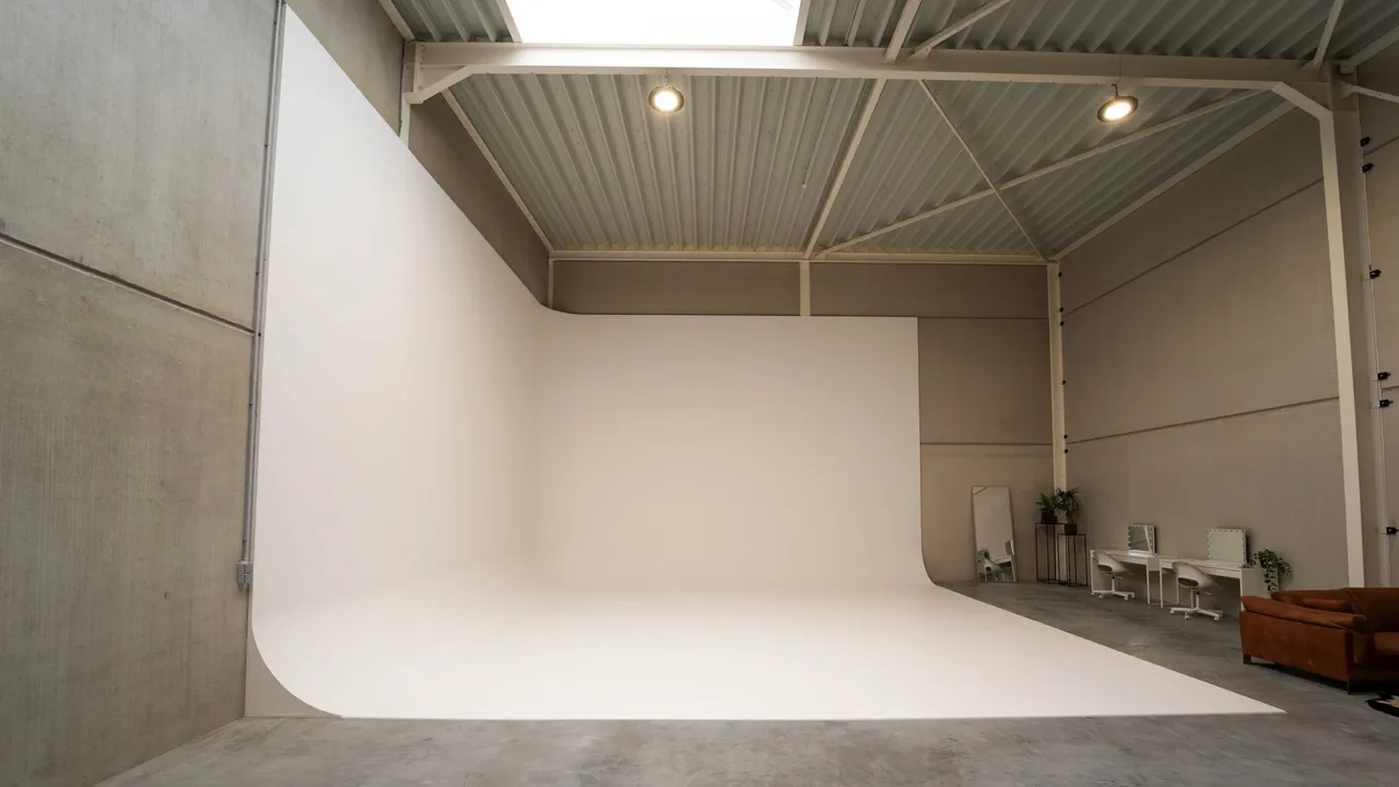
Parko is two things at once: a production company, and a large photo studio in Wavre open to every kind of project, run by Marco. A single brand could not hold both without crushing one of them. So the project produced a pair: a logo for the production side, a mascot for the place.
- Client
- Parko Studio
- Role
- Brand identity and website
- Year
- 2026
A photo studio almost always introduces itself the same way: understated, sober, a thin typeface on white. That was exactly what Marco did not want. The brief called for an image that cuts against that landscape and stays with you after a single visit, knowing it had to cover two activities at once, the production company and the space open to outside projects.
A logo for the company, a face for the place
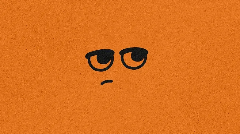
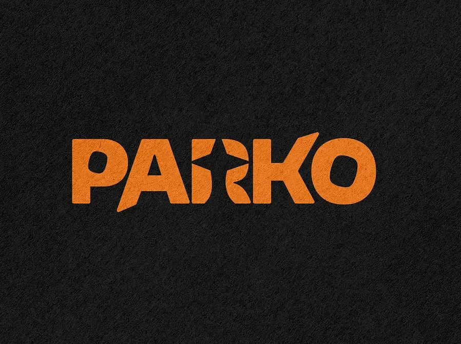
The Parko logo looks towards the 2000s, a light retro, with an R crossed by a star that speaks of progress and momentum. The mascot belongs to the studio: a nonchalant character, an offbeat tone, taking up a whole wall by the entrance and becoming the thing you remember on the way out. Orange is not the expected colour in this trade, and that is exactly what it is there for. The face then travels onto stickers, caps, anywhere the studio feels like showing up.
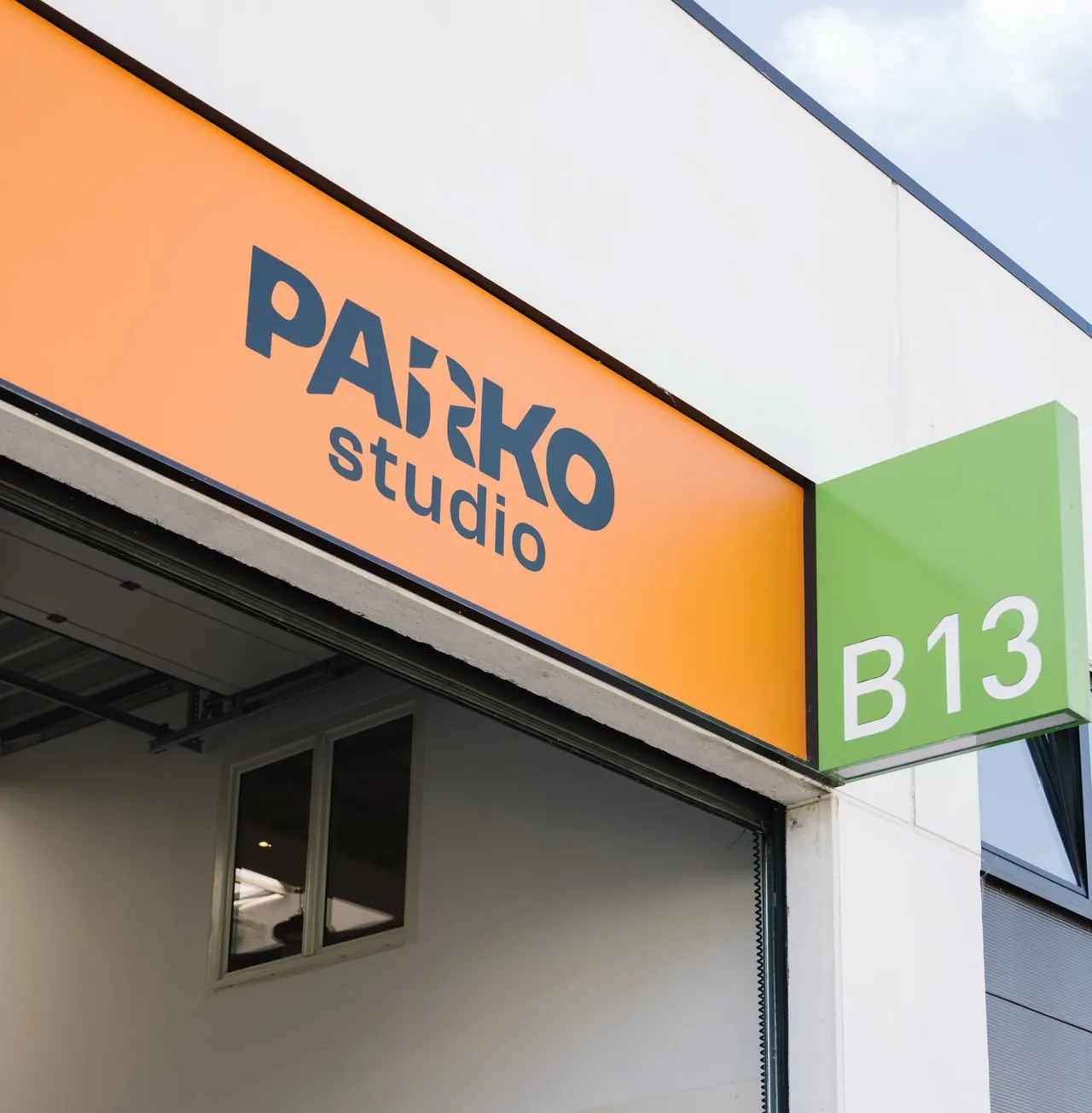
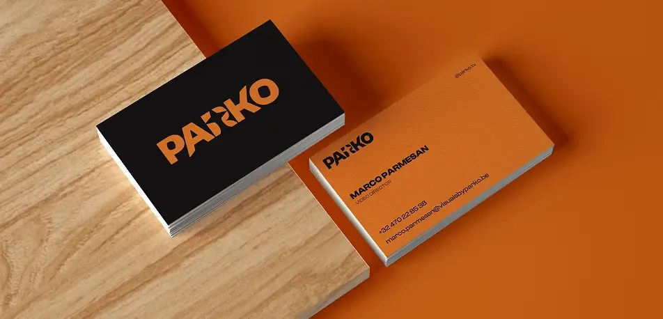
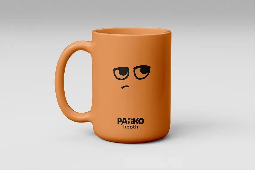
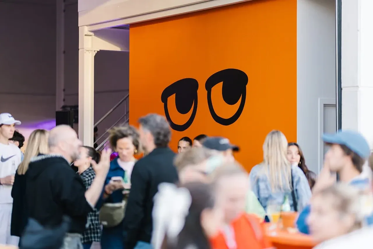
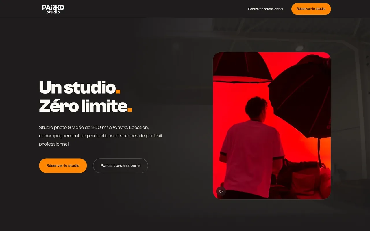
The pairing shows up most where you would not expect it: the studio sign, the business cards, a mug, the shooting floor, the events. Production keeps the logo, the venue keeps the mascot, and nobody needs to explain which is which. That kind of split lasts because it rests on no rule anyone has to remember. Marco puts the character wherever he feels like it, without coming back to ask each time.
- Logo for the production company
- Studio mascot, extended to stickers and textile
- Entrance mural and signage
- Business cards
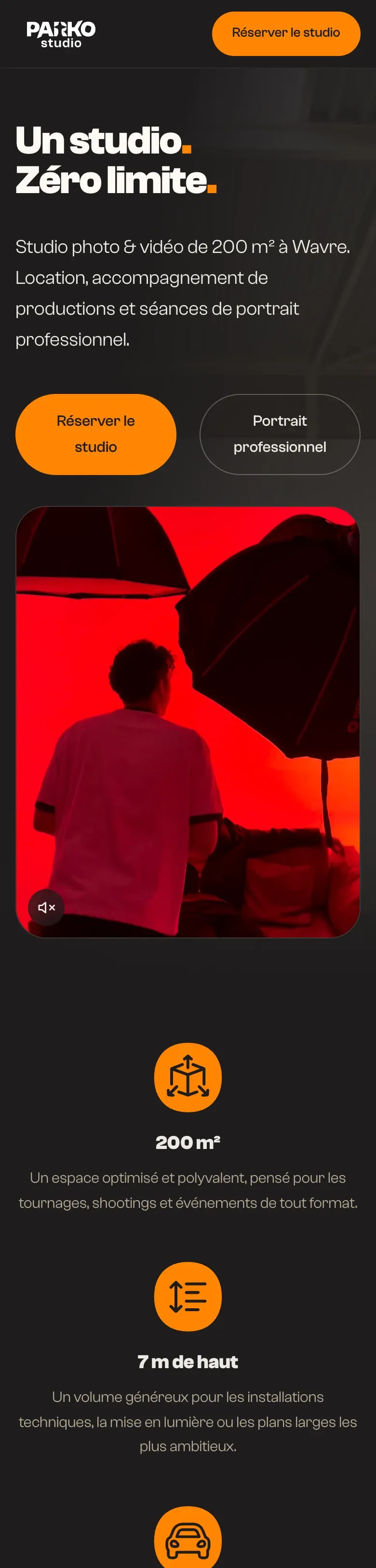
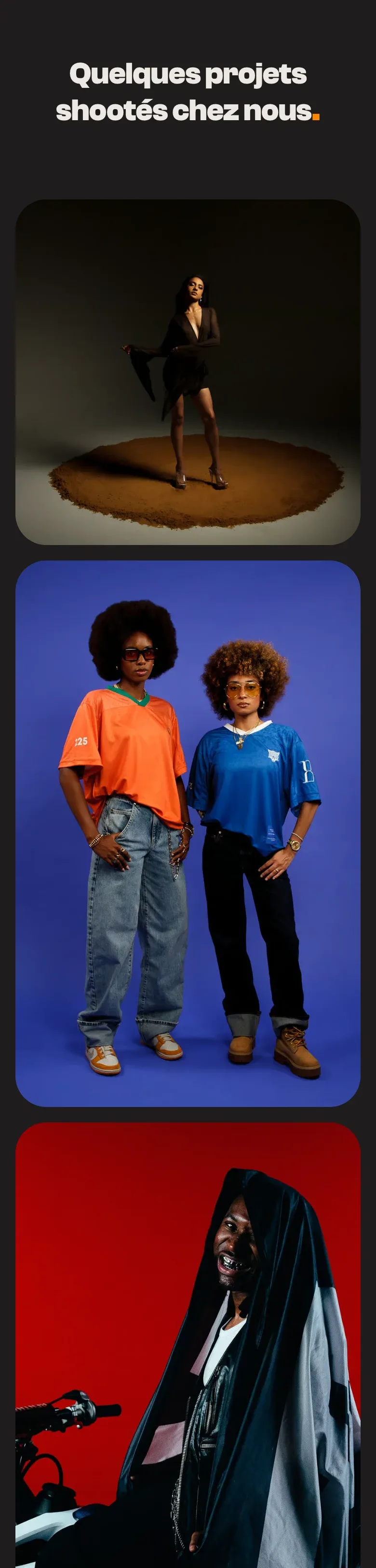
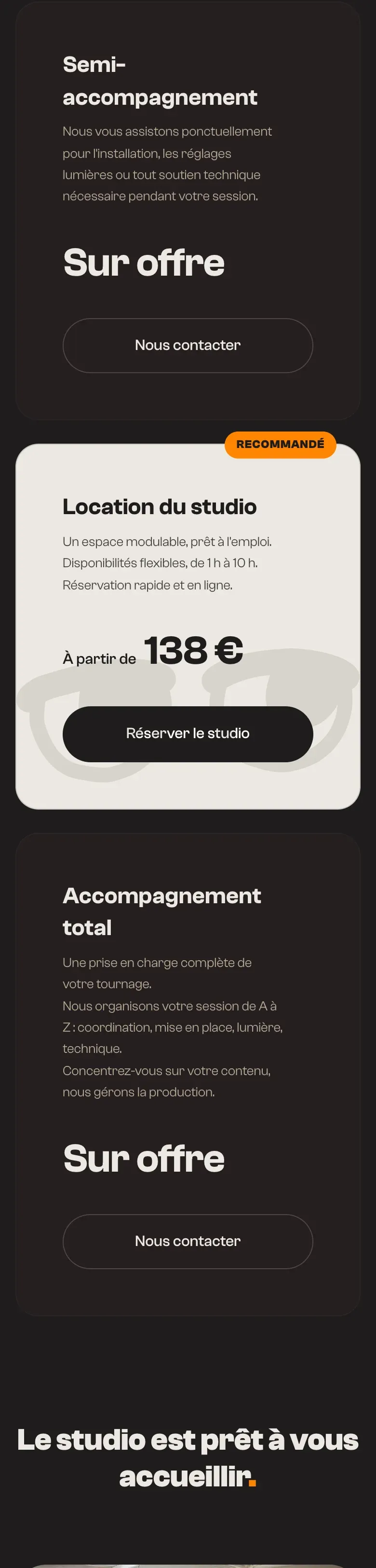
- Website and search optimisation

Before, during, after: the same method on every project
See our expertise · Art Direction, Branding & Naming Let's talk about your project- Before
Discovery
We get to know the project, ask our questions and talk it through with you.
- Before
Inspiration and direction
We gather inspiration and set a direction with you, before anything gets created.
- During
Creation
The heart of the project, paced by regular back and forth with you.
- After
Delivery and testing
We deliver, then check with you that everything works.
- After
Handover and adjustments
We train you and help you get to grips with the material. Your feedback is taken on board to fine-tune it.