Booza!
Brand identity
Booza is a Syrian coffee house in Ixelles, signed Baghdi Sar: a place for coffee, tea and pastries. Its name comes from booza, the Syrian pistachio ice cream that is the house speciality. The identity had to carry that busy-room energy rather than the hush of a tearoom, and make people want to walk in before they had read the menu.
- Client
- Booza
- Role
- Brand identity
- Year
- 2022
Georges Baghdi Sar was not a new name to the studio. A well-known Syrian chef in Brussels, he had already trusted the studio with the Mine Madeh identity. This time he opens a Syrian coffee house in Ixelles with his long-standing partner. The name came before the identity and already held the clue, since booza is a pistachio ice cream that stretches. The brief held in one sentence: a modern place you spot from the pavement, not another tearoom.
Three colours, not one more
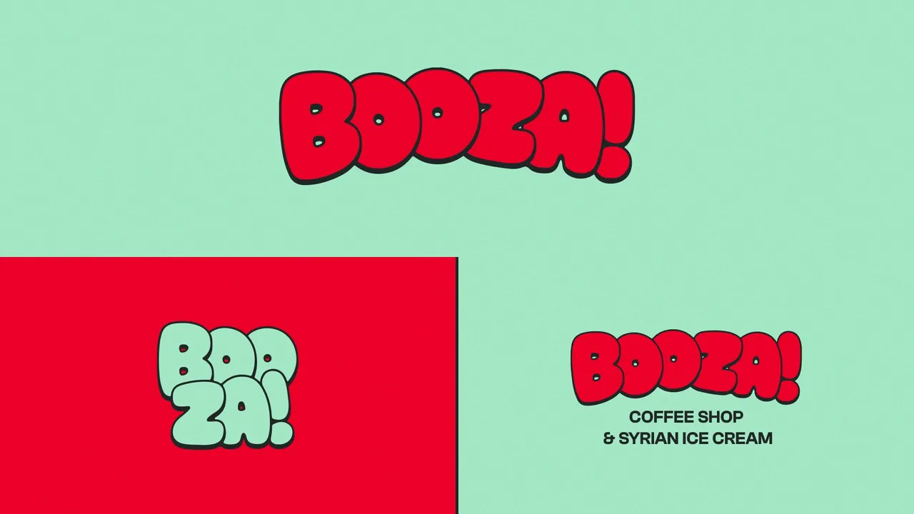
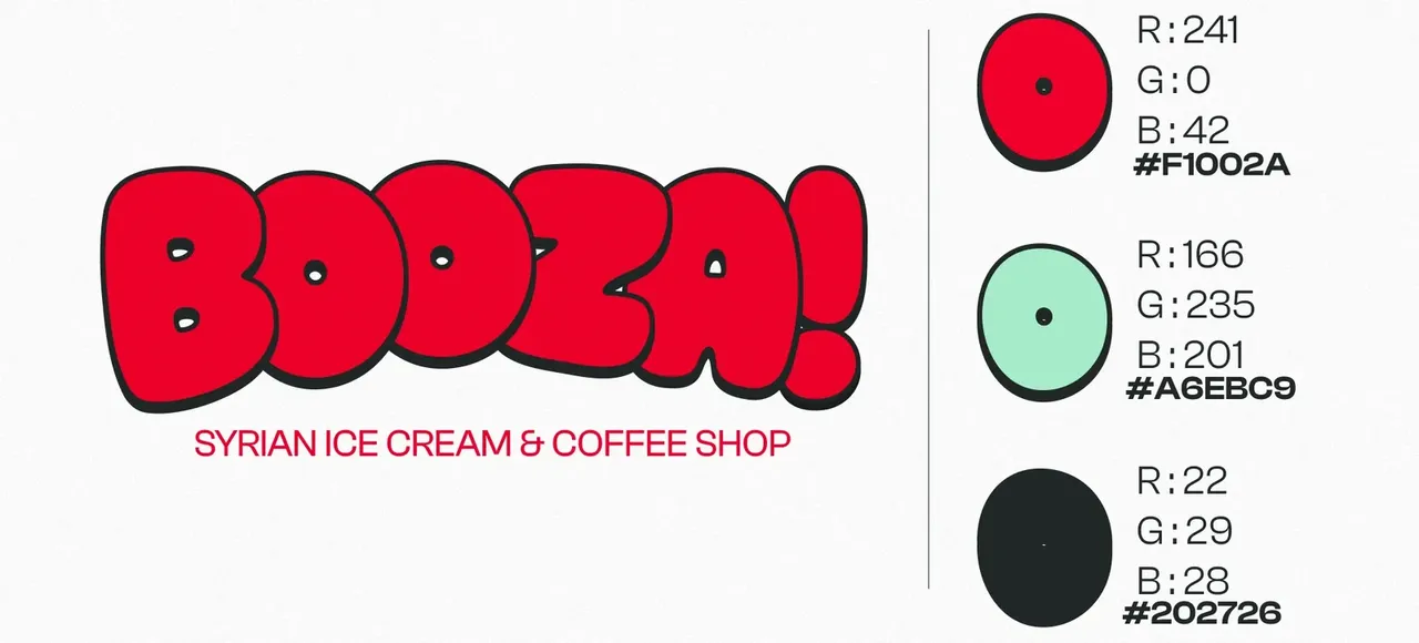
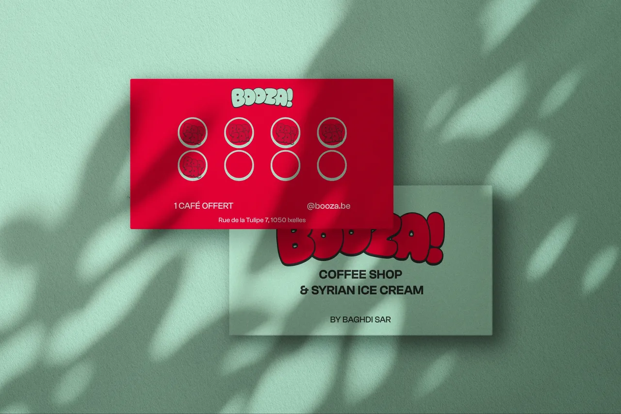
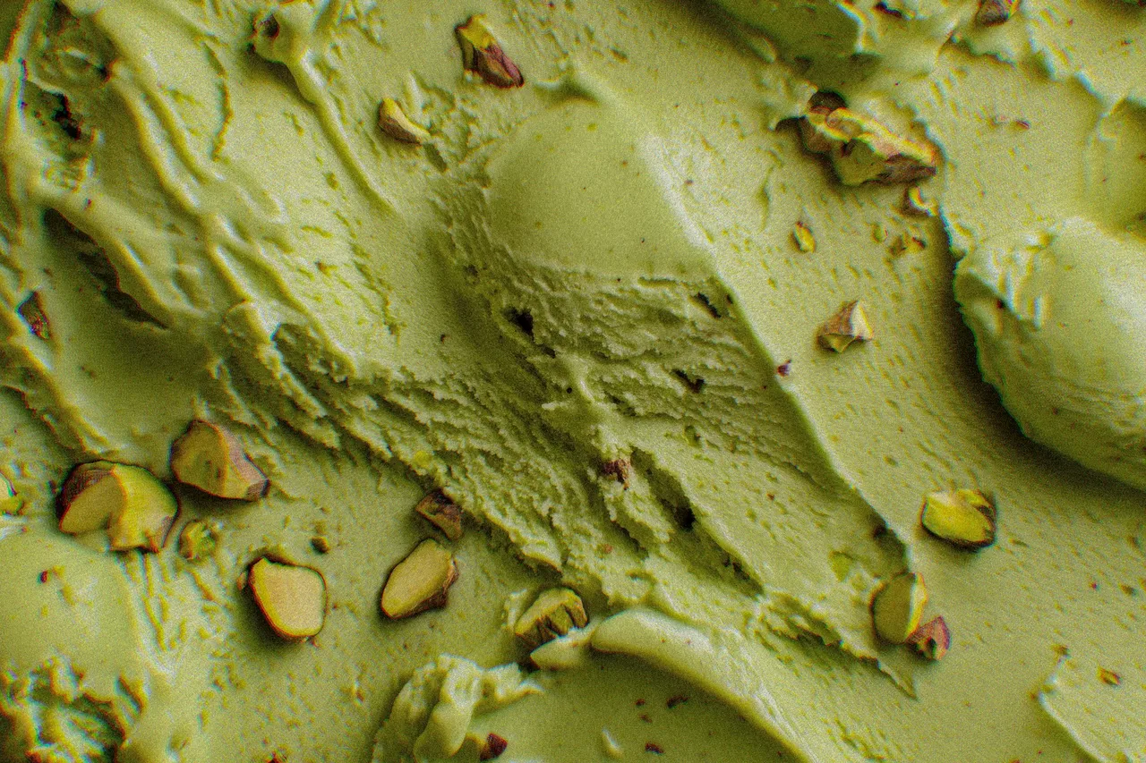
The house is named after a pistachio ice cream, so the main colour is pistachio. It is the shortest route between what you see and what you are about to taste, and it makes the palette appetising without having to say so. The system then holds in three values and nothing more: pistachio green #A6EBC9, a red #F1002A that snaps against it, a black #202726 to outline. The logotype is drawn in thick bubble letters, outline included, wall writing rather than typography. Enough to hold on a shopfront sign, a cup, a loyalty card or a sticker without ever changing register.
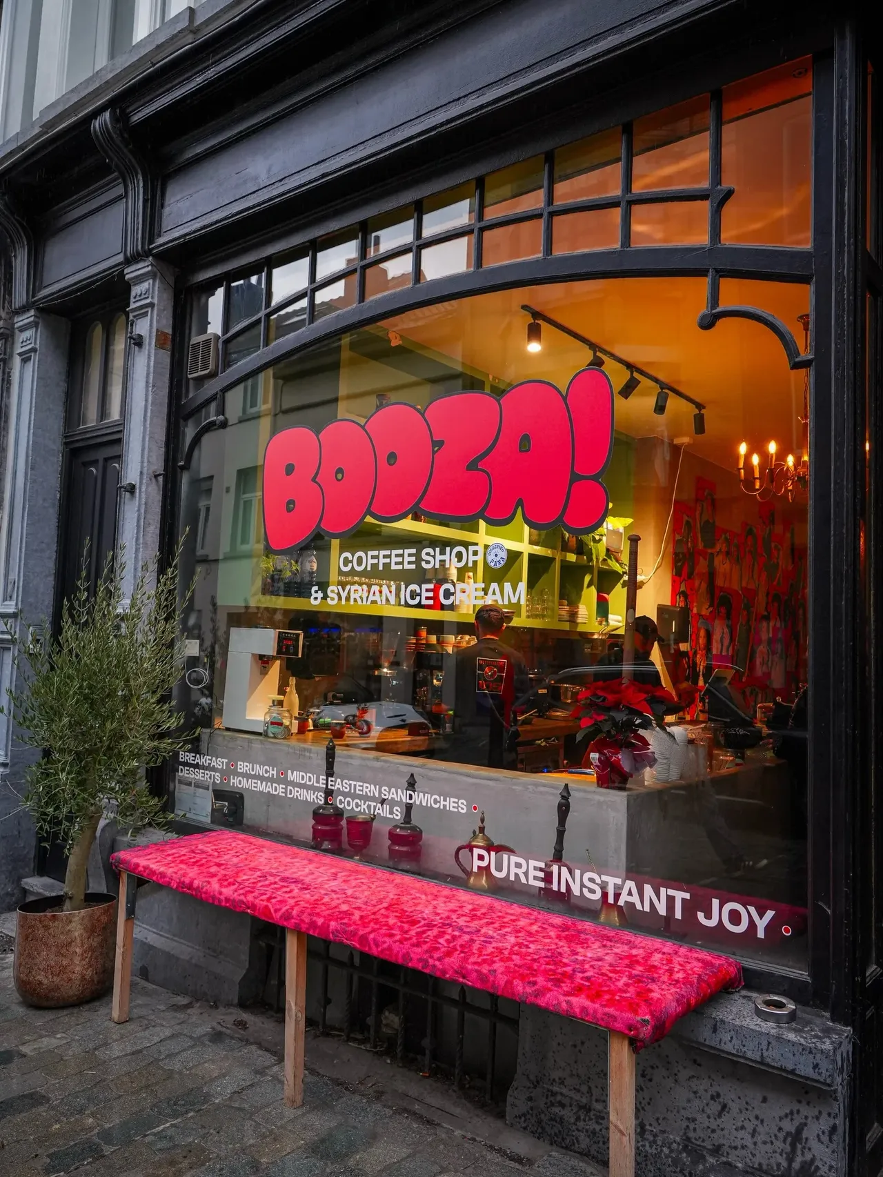
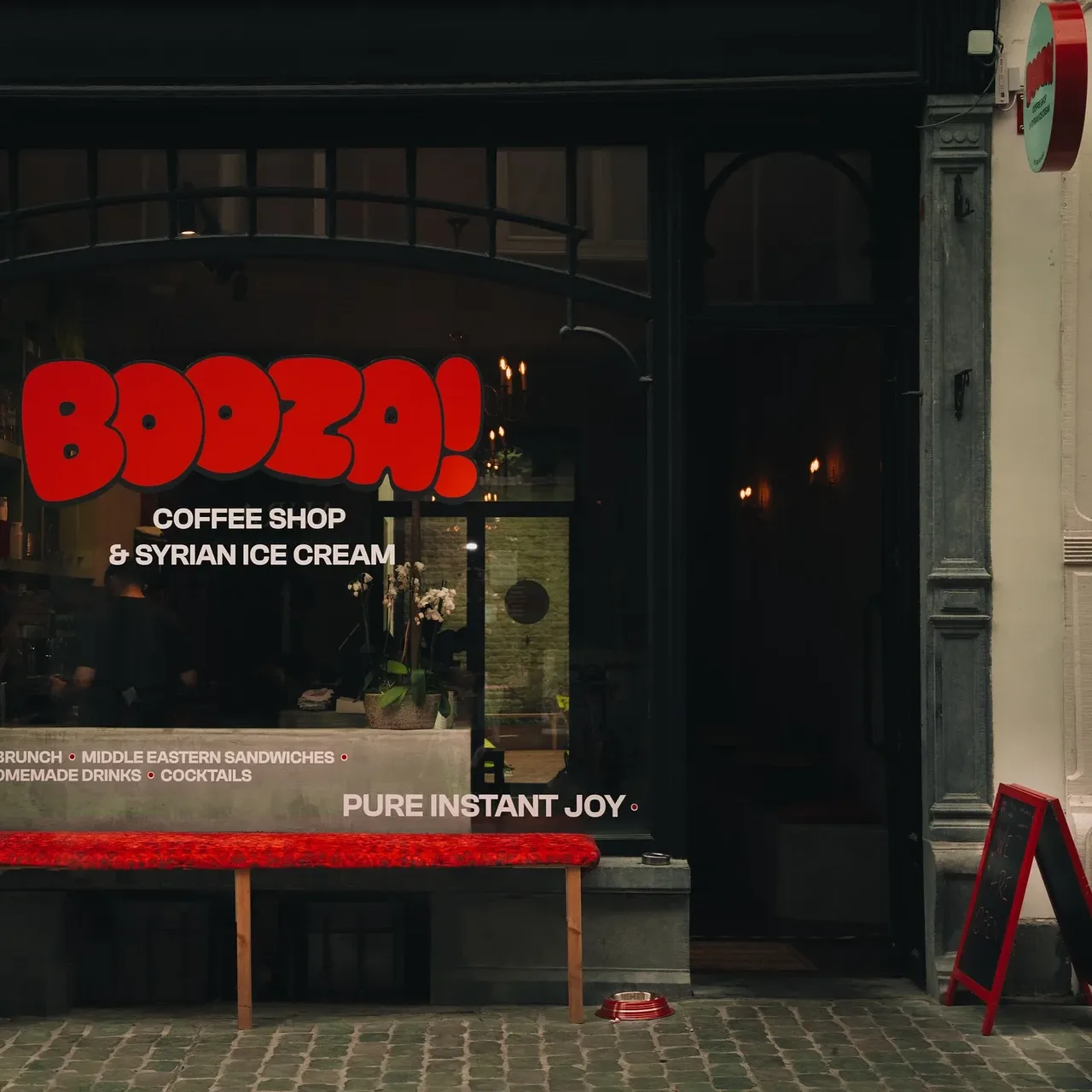
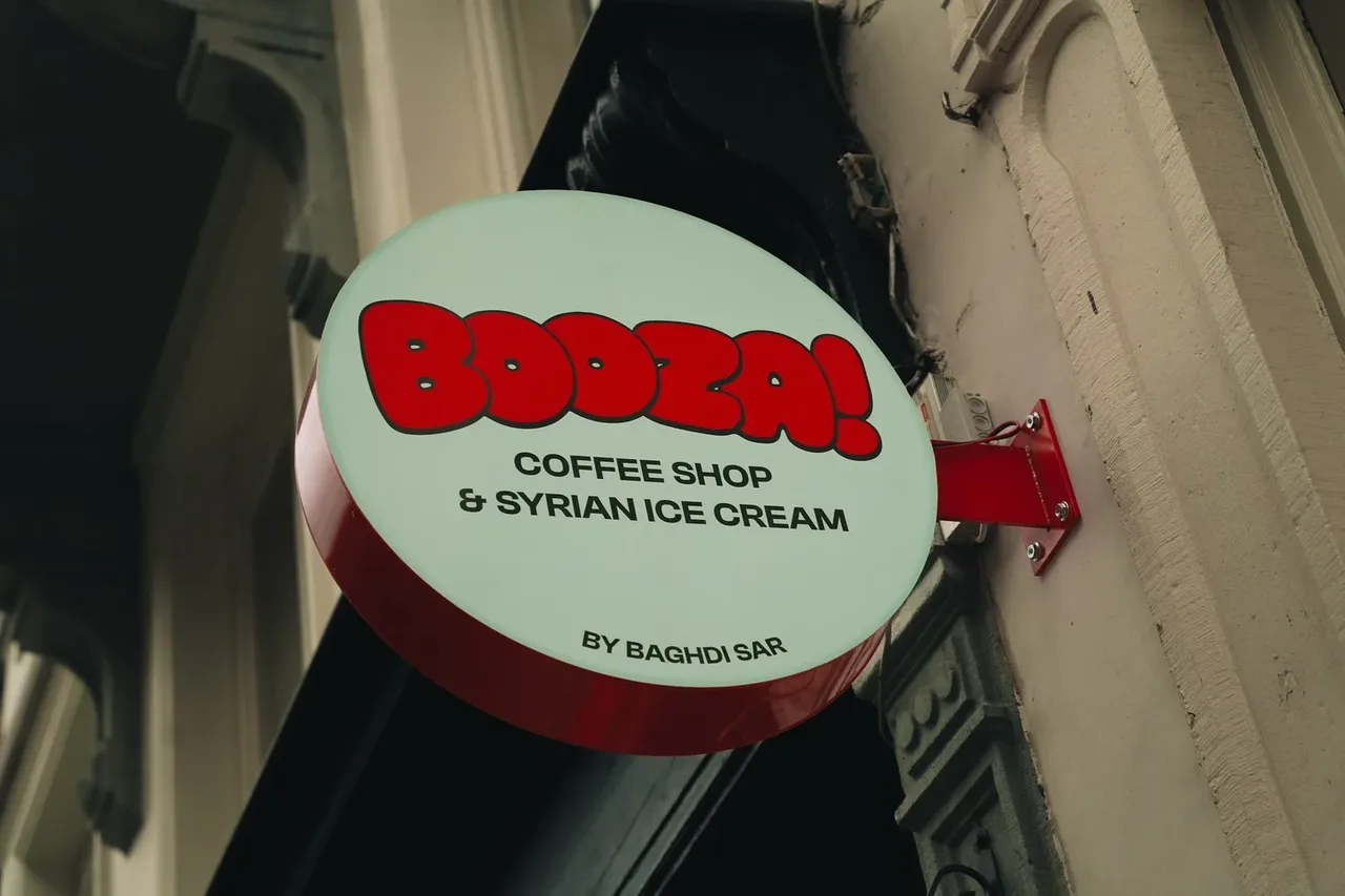
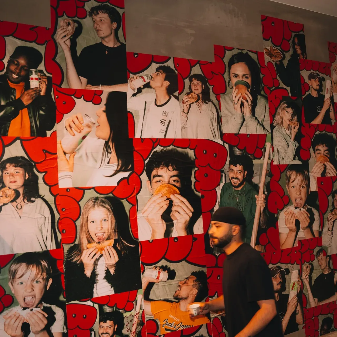
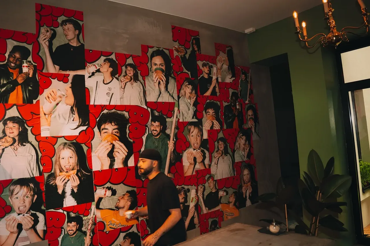
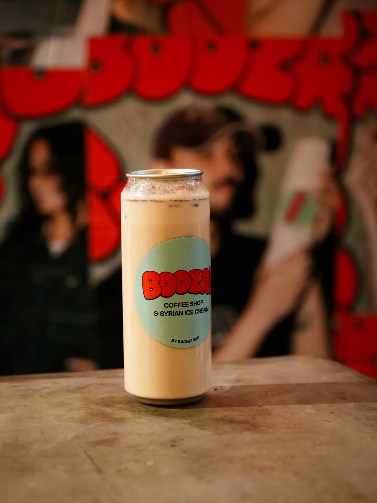
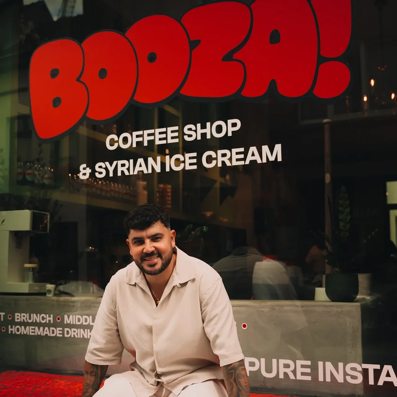
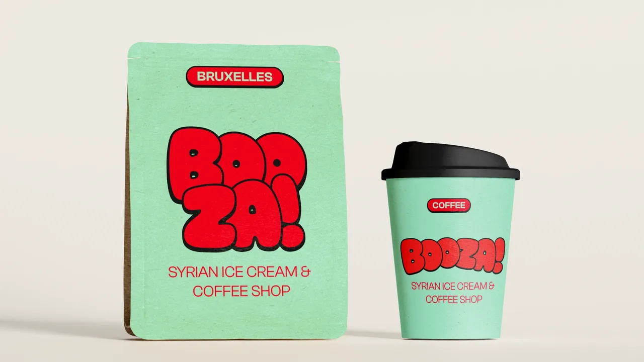
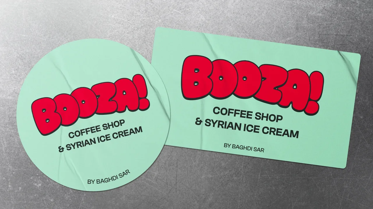
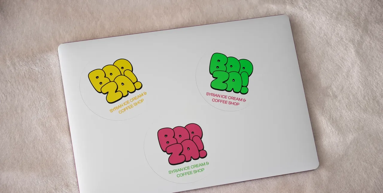
Three values only prove themselves on real objects. The green carries the sign and the window, the red works as a hook on stickers and the loyalty card, the black outlines whatever has to stay legible on a cup. No item ever called for a fourth colour, and that is the real test of a short palette. A café that has just opened prints fast and often, sometimes without a designer in the loop: the system had to hold without a manual.
- Logo and brand system
- House menus
- Sticker series for cups, cans and furniture
- Lit sign visible from the street
- Full window stickering
- Social media visuals
The items in numbers
- house menus, food and drinks
- 2
- sticker formats, round and rectangular
- 4
Counted on 28/09/2026 in the project files
Before, during, after: the same method on every project
See our expertise · Art Direction, Branding & Naming Let's talk about your project- Before
Discovery
We get to know the project, ask our questions and talk it through with you.
- Before
Inspiration and direction
We gather inspiration and set a direction with you, before anything gets created.
- During
Creation
The heart of the project, paced by regular back and forth with you.
- After
Delivery and testing
We deliver, then check with you that everything works.
- After
Handover and adjustments
We train you and help you get to grips with the material. Your feedback is taken on board to fine-tune it.