Mine Madeh
Brand identity redesign
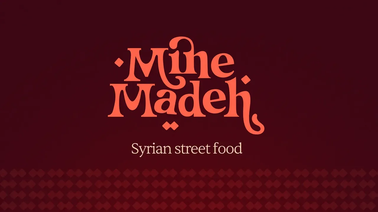
Mine Madeh is a Syrian restaurant in central Brussels. It already existed, with an image that was no longer doing it any favours. So the rebrand did not start from a blank page: keep what the regulars recognised, and lift everything else a notch.
- Client
- Mine Madeh
- Role
- Brand identity redesign
- Year
- 2023
The restaurant had been running for years when it prepared a second opening, in central Brussels. That deadline is what triggered the project: the existing image worked for a neighbourhood regular, not for an address people discover. The difficulty was holding two cultures in one mark, evoking Syrian cooking and tying it to Brussels, without falling into the picturesque decor that stalks this kind of brief.
Eleven dishes, one framing
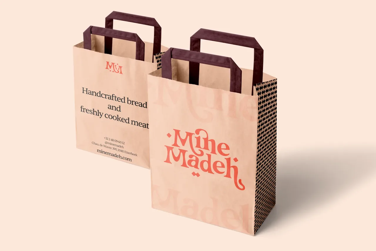
The orange already belonged to the house, its only solid visual landmark. Dropping it would have erased recognition; keeping it untouched would have kept the problem. So it was kept and modernised, set against sharper contrasts and an elegant typeface. The photography applies the same discipline. The whole menu is shot on a single device: an arm holding the dish out over the cobbles of the street, seen from above, in daylight. Eleven dishes, one framing. The series holds without captions, and the pavement reminds you in every frame that Mine Madeh is a place, not a delivery brand.
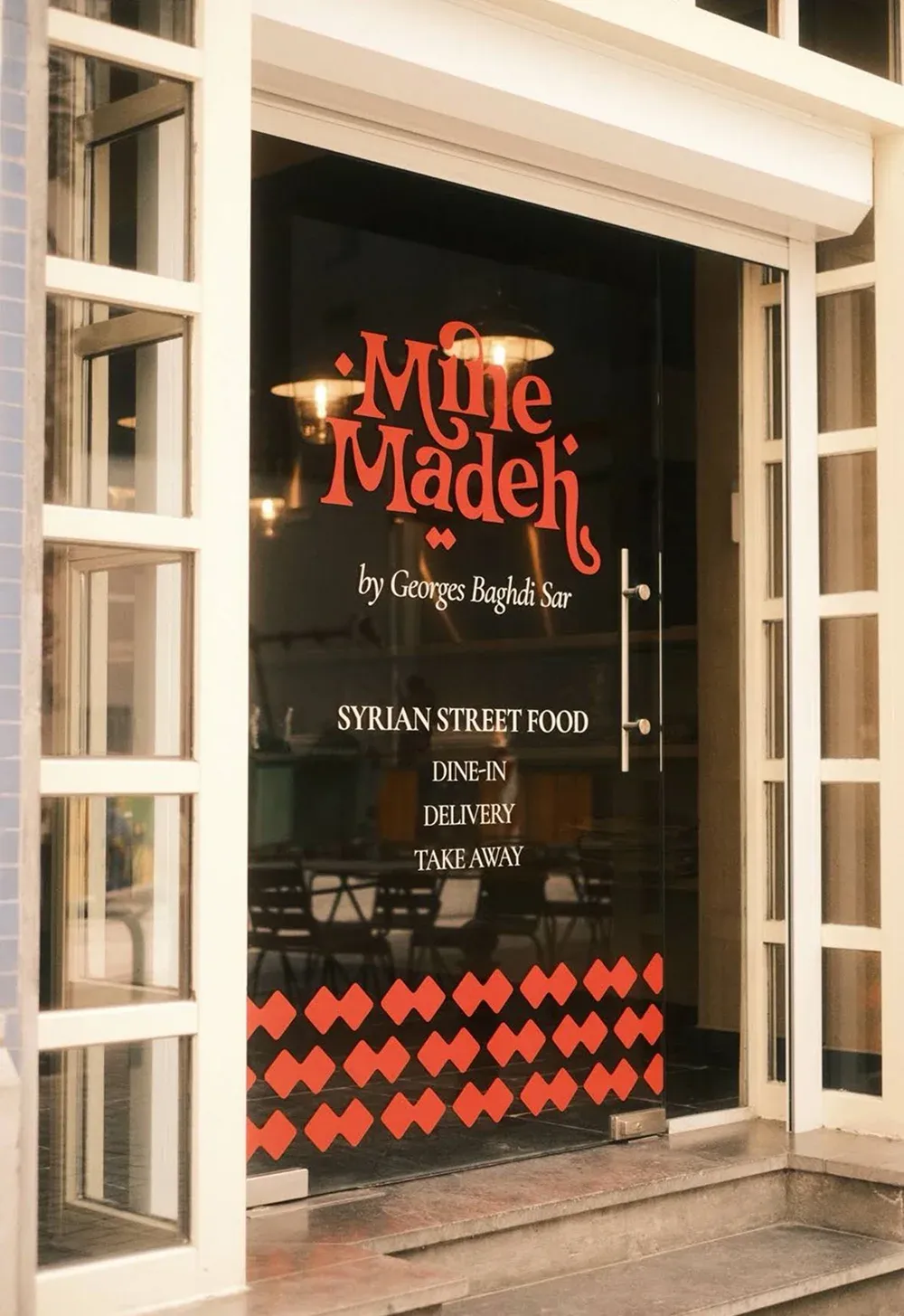
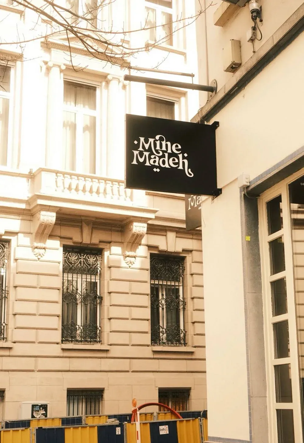
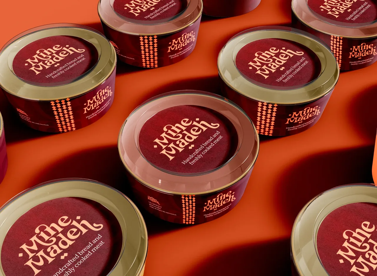
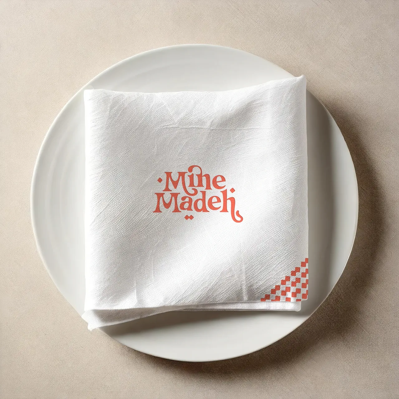
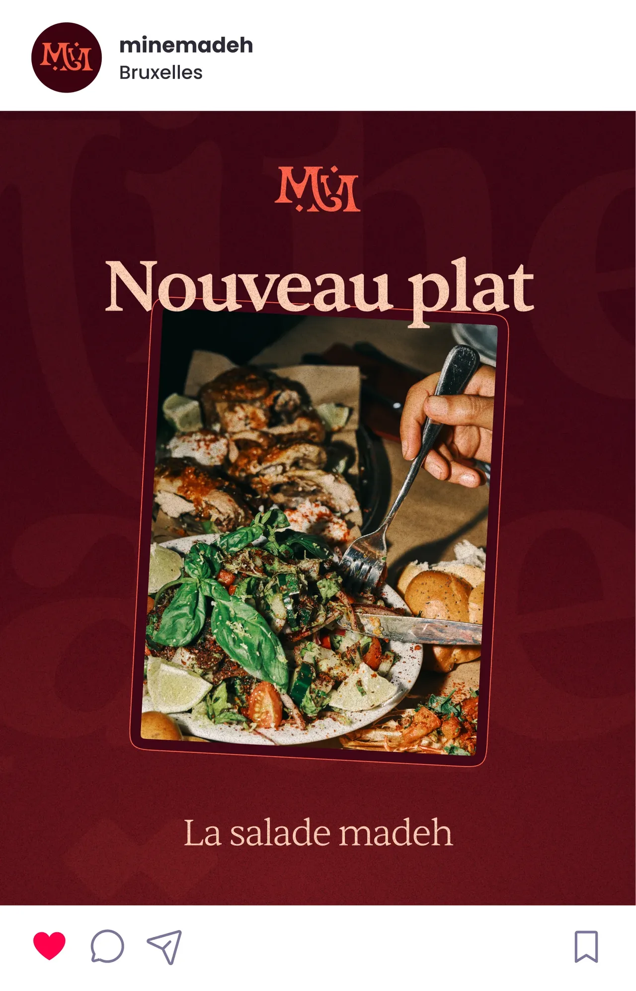
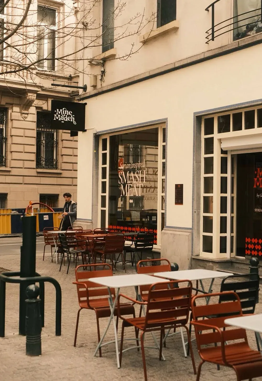
The façade and the windows follow the same rule as the menu: orange as the landmark, everything else held back. It is the one place where the identity has to work without being explained, because a restaurant is recognised from the pavement. The photo series serves the printed menu and social media alike. Eleven dishes shot once under the same setup is an image bank that removes the need to reshoot for every post.
- Brand identity redesign
- House menus
- Pavement sign
- Window stickering
- Shop signage
One series, one set-up
- dishes photographed with the same set-up
- 11
- languages for the printed menu, French and English
- 2
Counted on 28/09/2026 in the project files
Before, during, after: the same method on every project
See our expertise · Art Direction, Branding & Naming Let's talk about your project- Before
Discovery
We get to know the project, ask our questions and talk it through with you.
- Before
Inspiration and direction
We gather inspiration and set a direction with you, before anything gets created.
- During
Creation
The heart of the project, paced by regular back and forth with you.
- After
Delivery and testing
We deliver, then check with you that everything works.
- After
Handover and adjustments
We train you and help you get to grips with the material. Your feedback is taken on board to fine-tune it.