Miam
Brand identity
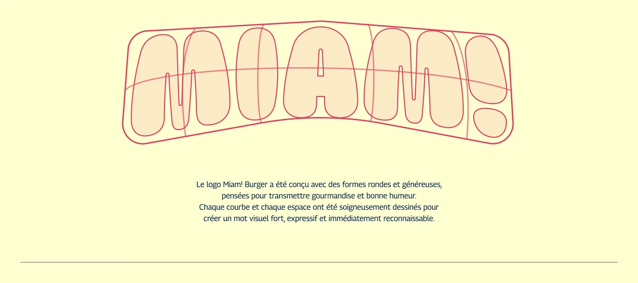
Miam! Burger is a Brussels burger brand launched by Brussels creator Vidal (@vidalalexe), followed by more than 500,000 people on TikTok. The audience existed before the shop did, and it lives on social media: the brand had to be recognisable at thumbnail size, at the speed of a scrolling thumb. Hence the round, generous shapes, an exclamation mark doing all the attitude work, and pop colours with no half measures. The 2025 brand book holds it together, from the drawing of the logo to photo direction.
- Client
- Miam! Burger
- Role
- Brand identity
- Year
- 2025
The restaurant was born from an audience, not a location: its founder is a Brussels content creator followed by hundreds of thousands of people on Instagram, TikTok and YouTube. The menu extends that culture, with burgers whose names and ingredients point to Belgian references. The brief was therefore a transfer: carrying into a physical brand the tone of an audience that first met it on a screen.
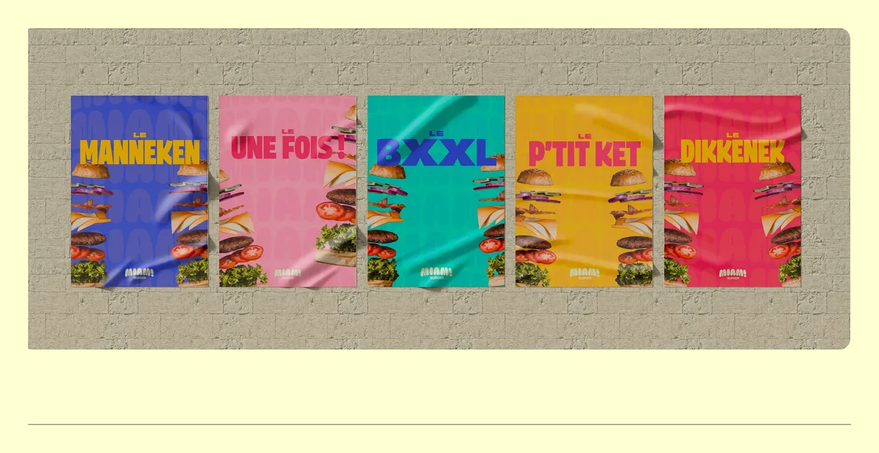
Brussels slang as a graphic element
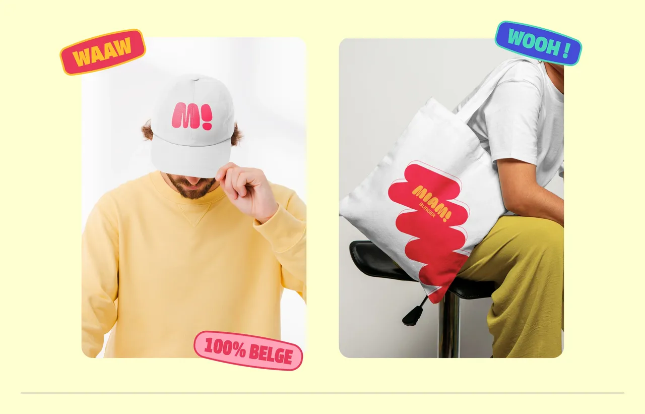
Two assets carry the personality beyond the logo. The scribble first, a free, organic shape that slips behind a product or a message to give it movement without ever stealing the show. Then the expression tags, borrowed from Brussels slang: waaw, wooh, 100% belge, afou j'ai faim. They are not ornaments, they are hooks, dropped onto a photo or a pack so the tone lands before the words are even read. Photo direction follows the same rule: wide angle, caught on the fly, never posed.
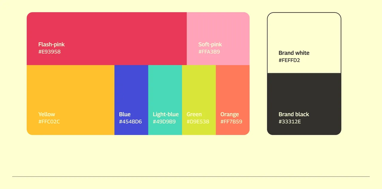
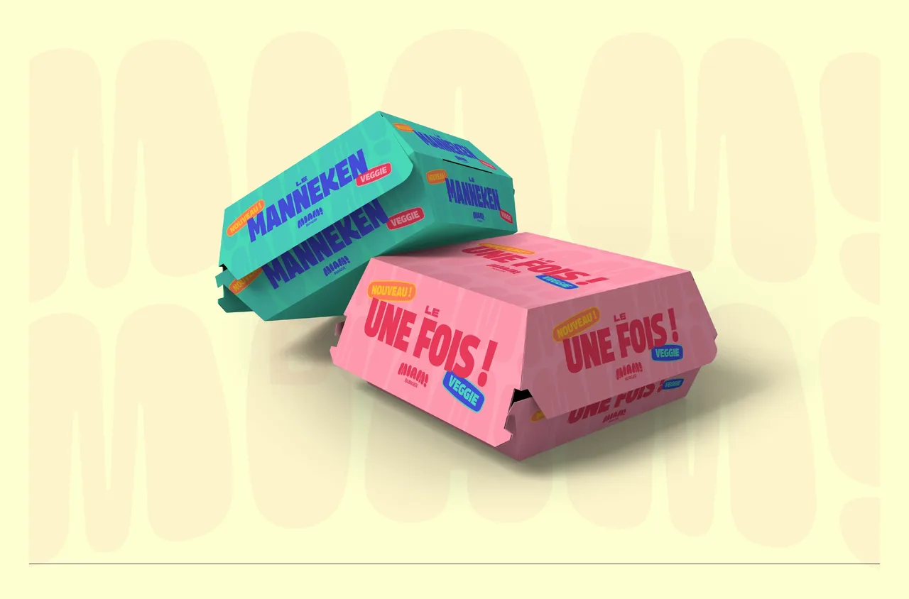
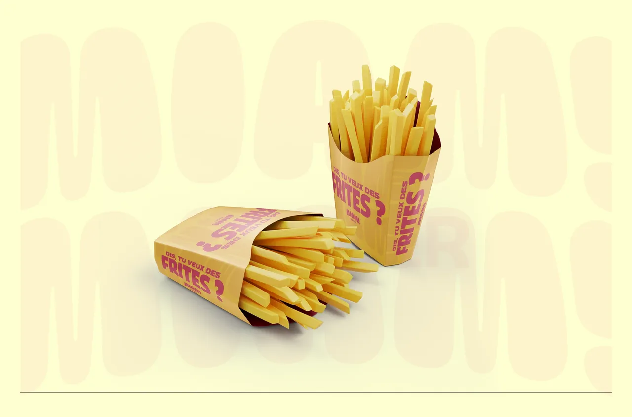
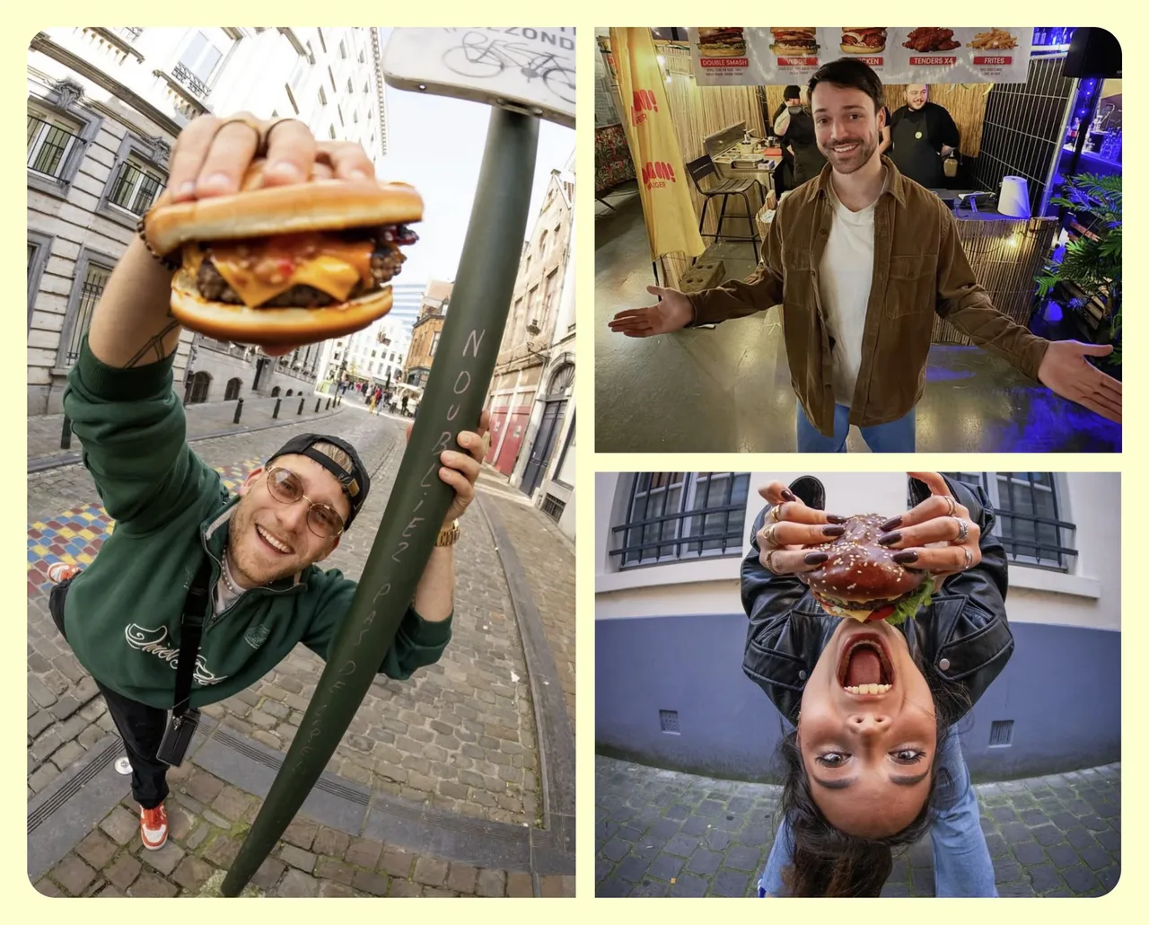
Packaging and posters are where the brand really plays out, because that is where it is seen for real rather than as a thumbnail. The round shapes hold on a fries box as well as on a billboard, the scribble catches up the proportions when a format stretches, and the tags go on last, once the photo is settled. The wide-angle photo direction takes care of the rest: it produces images that work in a story and in print alike.
- Brand identity and a logo that adapts across several colours
- Colourful packaging, designed to stand out on a shelf and in a photo
- Art direction for photography and social media
What the brand book holds
- pages of brand book, from the logo drawing to the photo direction
- 38
- colours in which the logo and the icon are delivered
- 6
Counted on 28/09/2026 in the project files
Before, during, after: the same method on every project
See our expertise · Art Direction, Branding & Naming Let's talk about your project- Before
Discovery
We get to know the project, ask our questions and talk it through with you.
- Before
Inspiration and direction
We gather inspiration and set a direction with you, before anything gets created.
- During
Creation
The heart of the project, paced by regular back and forth with you.
- After
Delivery and testing
We deliver, then check with you that everything works.
- After
Handover and adjustments
We train you and help you get to grips with the material. Your feedback is taken on board to fine-tune it.