Spread.it
Brand identity redesign and system
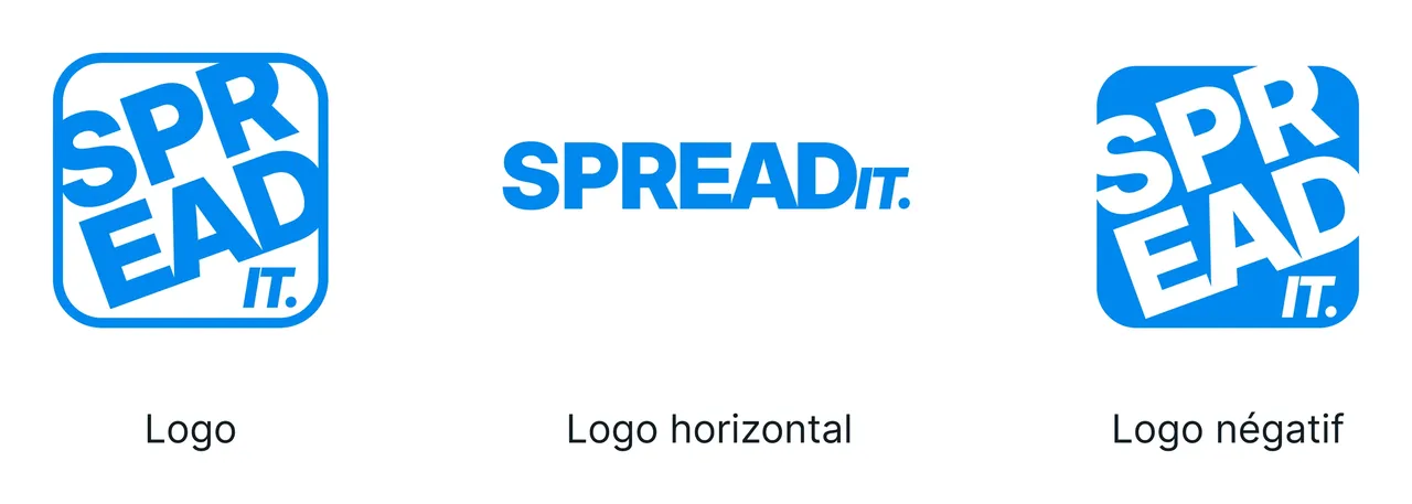
Spread.it is a digital communications agency. Its logo already worked: the idea was sound, the mark memorable. What went wrong was in the execution, a rectangle too thin, lettering pushed too far right, an overall balance that made the brand unreadable as soon as it shrank. The brief was therefore not to invent a brand, but to repair the one that existed and open up the whole system around it.
- Client
- Spread.it
- Role
- Brand identity redesign and system
- Year
- 2026
- Tools
- Figma, Illustrator, After Effects
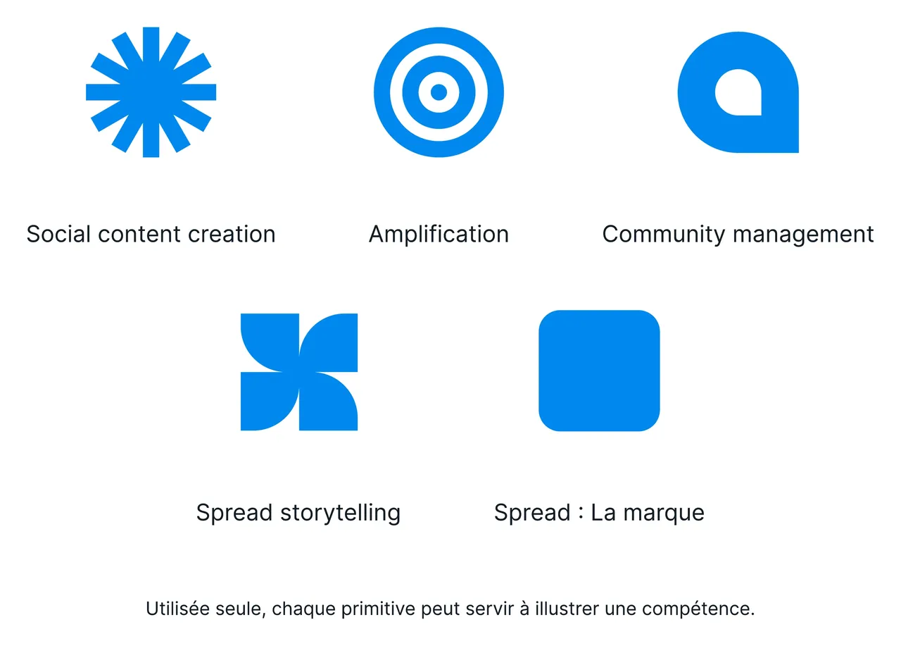
Five shapes that name what the agency sells
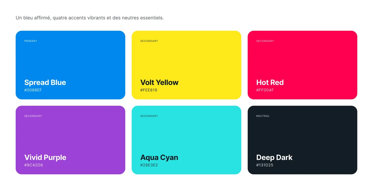
The system does not stop at the logo. Five primitives sit at its core, each carrying one pillar of the business: social content creation, amplification, community management, storytelling, and the brand itself. On its own, a primitive illustrates one skill; together, they stand for the whole agency. They exist in positive and negative, and combine with cut-out photography, which makes them a composition language rather than an icon library. The rest follows the same tool-shaped logic: a 60·30·10 colour distribution rule, a full type scale from display down to legal caption, and a signature generator the team runs without going through us.
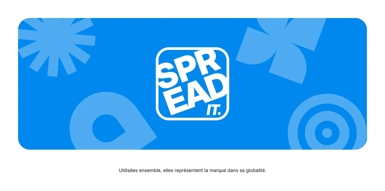

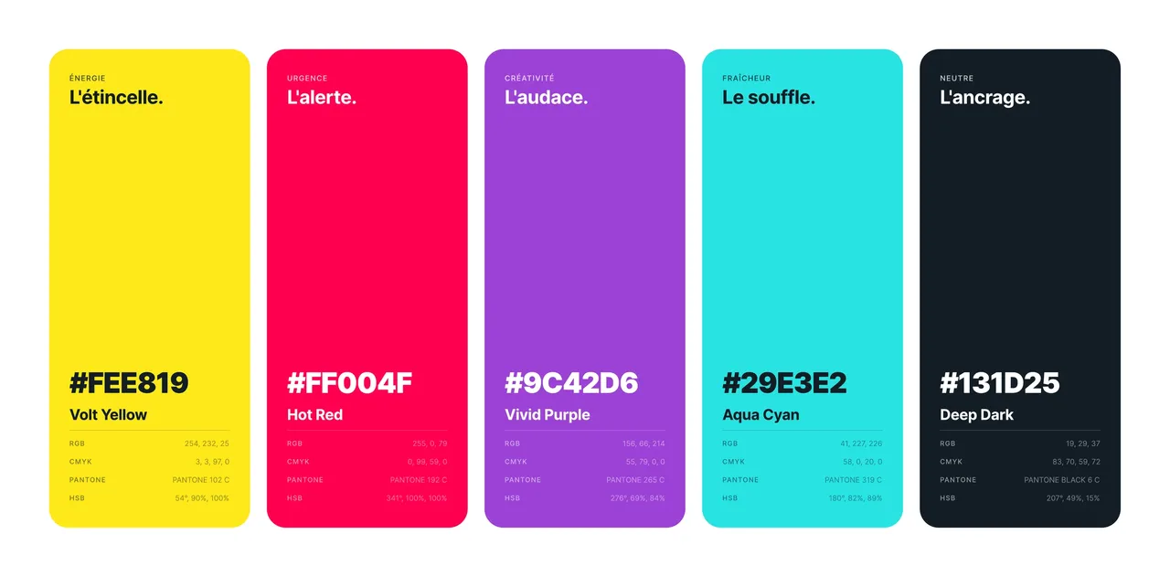
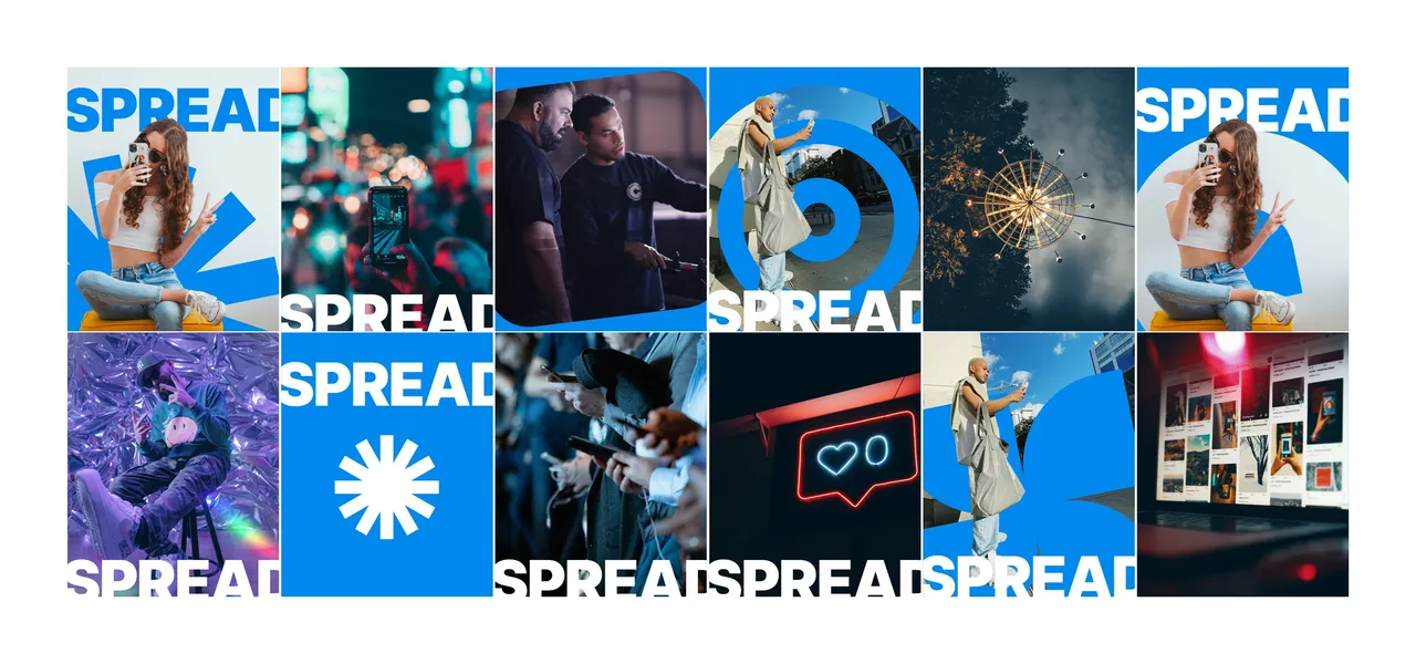
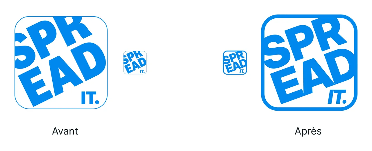
The logo repair is easier to see than to explain: the old and the new set side by side, same concept, same letters, a rebalanced rectangle and lettering that finally holds at small sizes. The mark is then animated, because a digital agency introduces itself in video as much as in still images. The rest of the system ships as a working tool rather than a rulebook: the palette specs, the type scale and the signature generator exist so the team can move without us, which is the only proof that a system holds.
Delivered as a working toolkit
- pages of the 2026 brand book
- 29
- graphic primitives delivered as files, one per business pillar
- 5
- animated outros for the agency's videos
- 3
Counted on 28/09/2026 in the project files
Before, during, after: the same method on every project
See our expertise · Art Direction, Branding & Naming Let's talk about your project- Before
Discovery
We get to know the project, ask our questions and talk it through with you.
- Before
Inspiration and direction
We gather inspiration and set a direction with you, before anything gets created.
- During
Creation
The heart of the project, paced by regular back and forth with you.
- After
Delivery and testing
We deliver, then check with you that everything works.
- After
Handover and adjustments
We train you and help you get to grips with the material. Your feedback is taken on board to fine-tune it.