Wagas is a competition: you take your chance on a prize, and a charity benefits. The brand puts it in one line, play to win, play to help. Two promises in the same gesture, one very concrete and the other more distant, which had to be connected in the imagery without the second one sounding like a sales argument.
- Client
- Wagas
- Role
- Brand identity and website
- Year
- 2026
The project did not start here: a first site had been commissioned from another team, with no interface or experience work, and above all no brand image at all. Everything had to be taken over. The tension was clear: a prize draw has to inspire trust before it inspires desire, and the prizes at stake, a car, a watch, a bike, computer equipment, called for a premium register that the cheerfulness could not contradict.

One ribbon, three roles
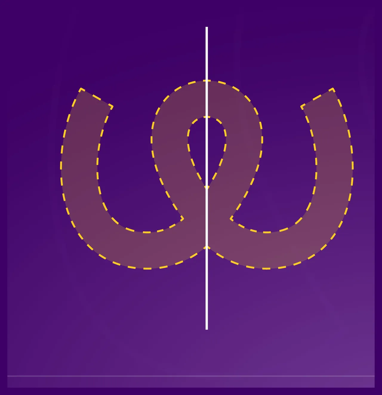
The ribbon is the centrepiece of the system, because it holds three roles on its own. It is the W of Wagas. It is the confetti that falls when someone wins. And it is the path linking every entrant to the projects being funded, from the prize to the charity and on to the people it helps. One shape, then, rather than a logo on one side and a set of graphics on the other: the link between the game and the cause is drawn, not explained. The logo itself is built on perfect symmetry, and its central axis carries the hardest promise a competition has to keep, transparency.

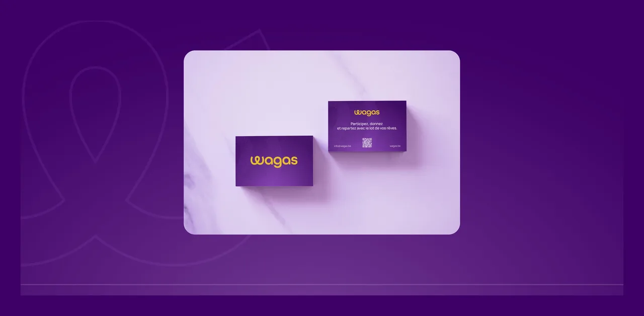
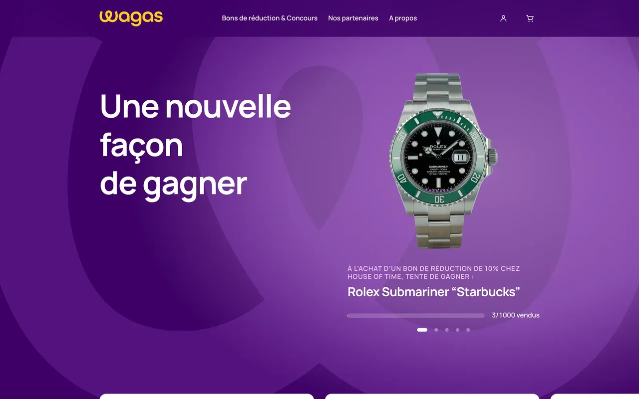
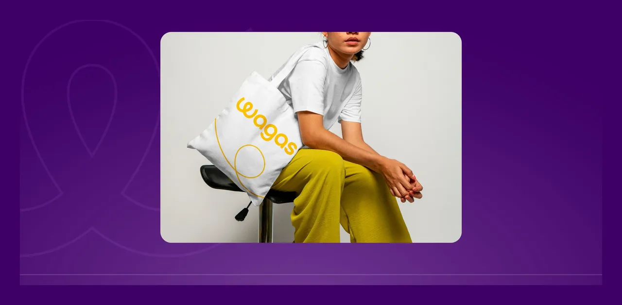
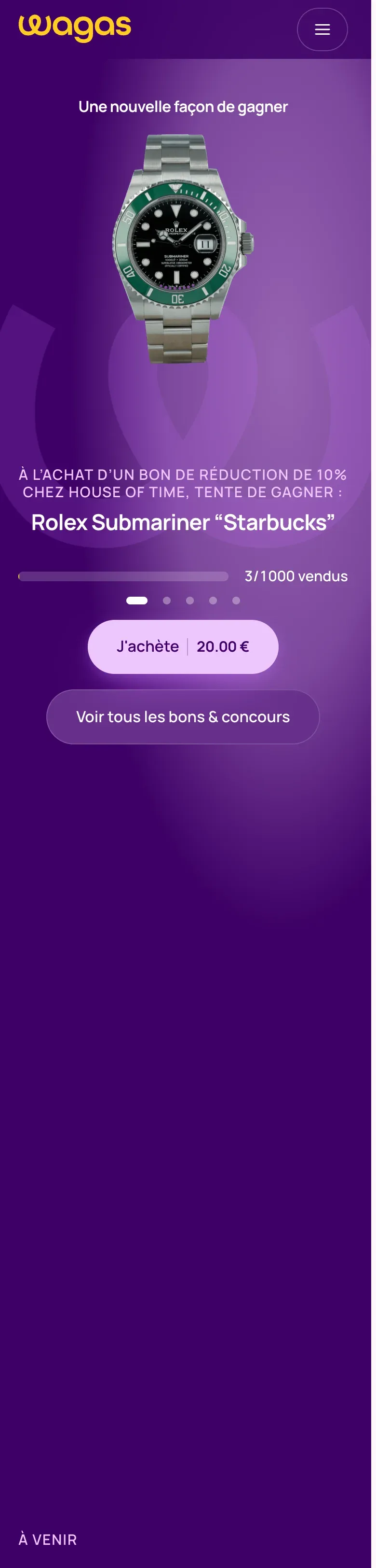
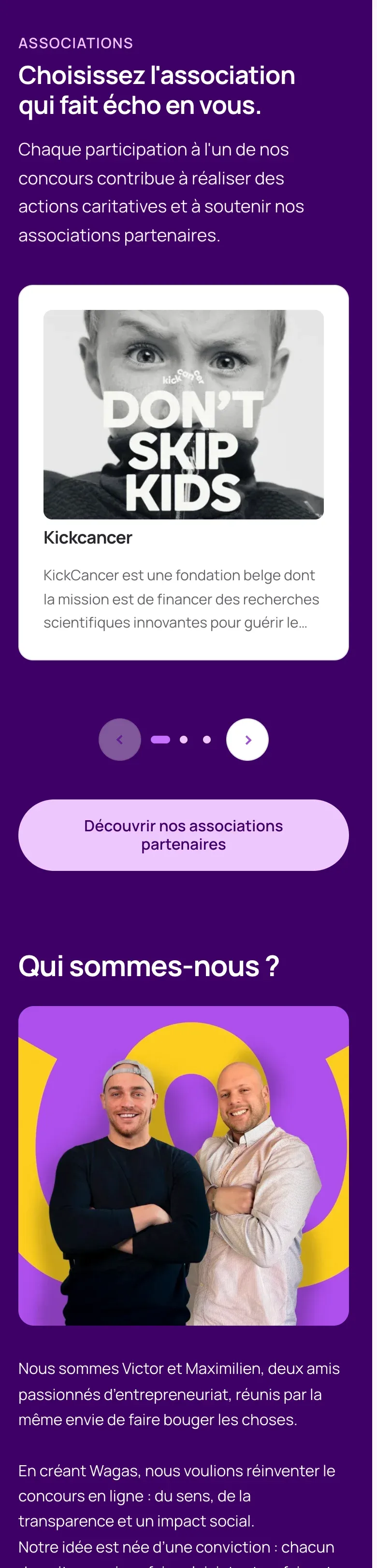
The ribbon carries on wherever the competition shows up: large-format posters, cards, the tote bag, and the site where it guides the eye from one screen to the next. On a phone it is what holds the continuity between the prize you are looking at and the cause you are backing, even as the page scrolls. One shape across every surface removes the need to repeat the message: the link is seen before it is read, including by someone just passing through.
- Full brand identity creation
- Website, interface and experience rebuilt from scratch
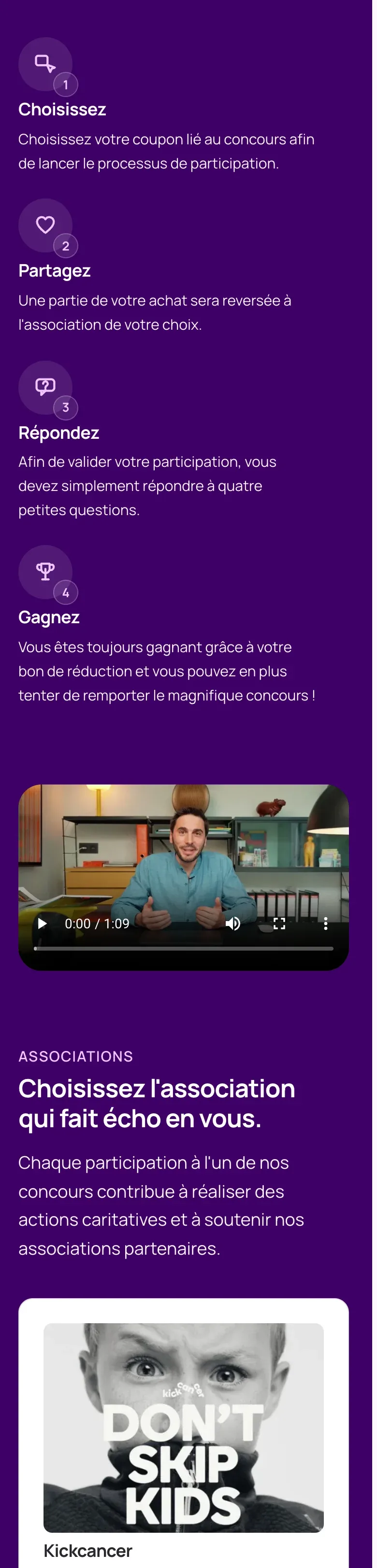
- E-commerce module and prize draw mechanics
- Cards distributed in shops

Before, during, after: the same method on every project
See our expertise · Art Direction, Branding & Naming Let's talk about your project- Before
Discovery
We get to know the project, ask our questions and talk it through with you.
- Before
Inspiration and direction
We gather inspiration and set a direction with you, before anything gets created.
- During
Creation
The heart of the project, paced by regular back and forth with you.
- After
Delivery and testing
We deliver, then check with you that everything works.
- After
Handover and adjustments
We train you and help you get to grips with the material. Your feedback is taken on board to fine-tune it.