Manor Belgium
Brand identity
Manor Belgium is a Belgian house of home-care products founded by Lucile Rochelet-de Galard. She was looking for a washing-up liquid with a natural formula, Belgian, and good-looking enough to stay out on the counter. It did not exist, so she made it. Three probiotic products in glass bottles: the brand had to hold heritage and modern efficacy together.
- Client
- Manor Belgium
- Role
- Brand identity
- Year
- 2026
The project came from a personal gap before it was a brand: Lucile was looking for a product that did not exist, and decided to make it. She was as involved in creating her image as in her formulas, which changes the nature of the work: this was not about dressing a finished product, but giving a story and a bearing to a house being built at the same time. The identity had to convey trust, class and harmony, three words she would not let go of.
A seal rather than a logo
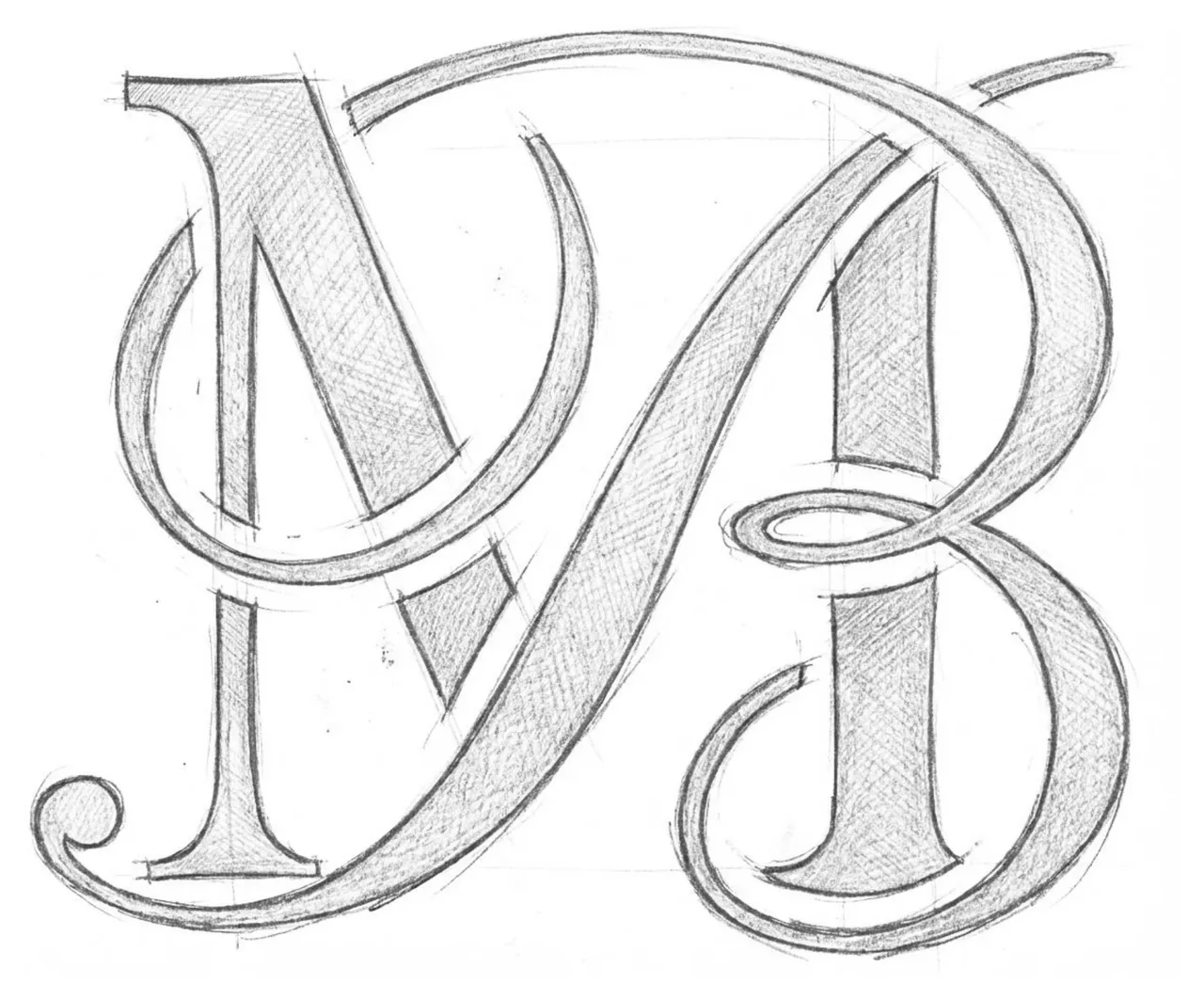
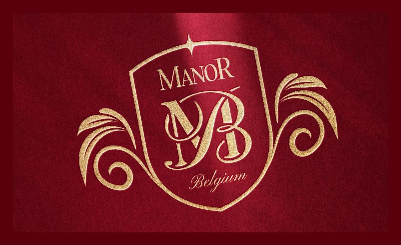
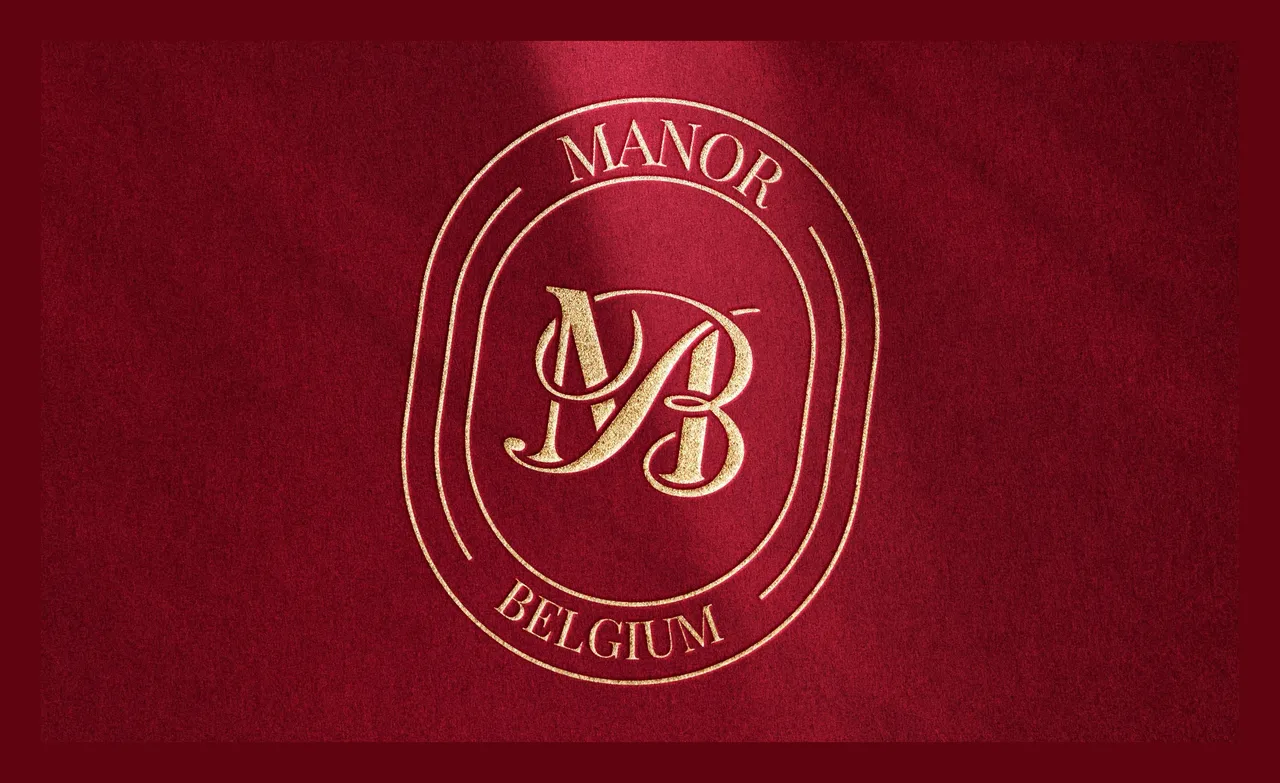
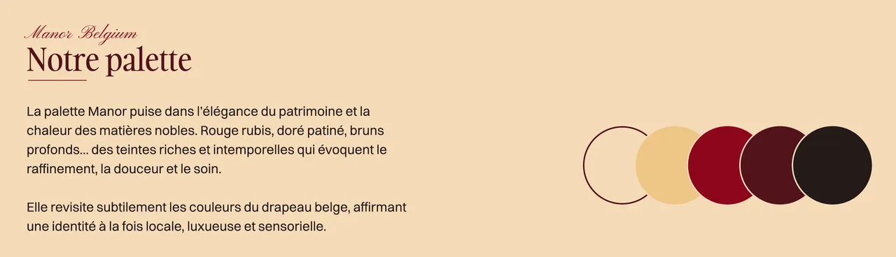
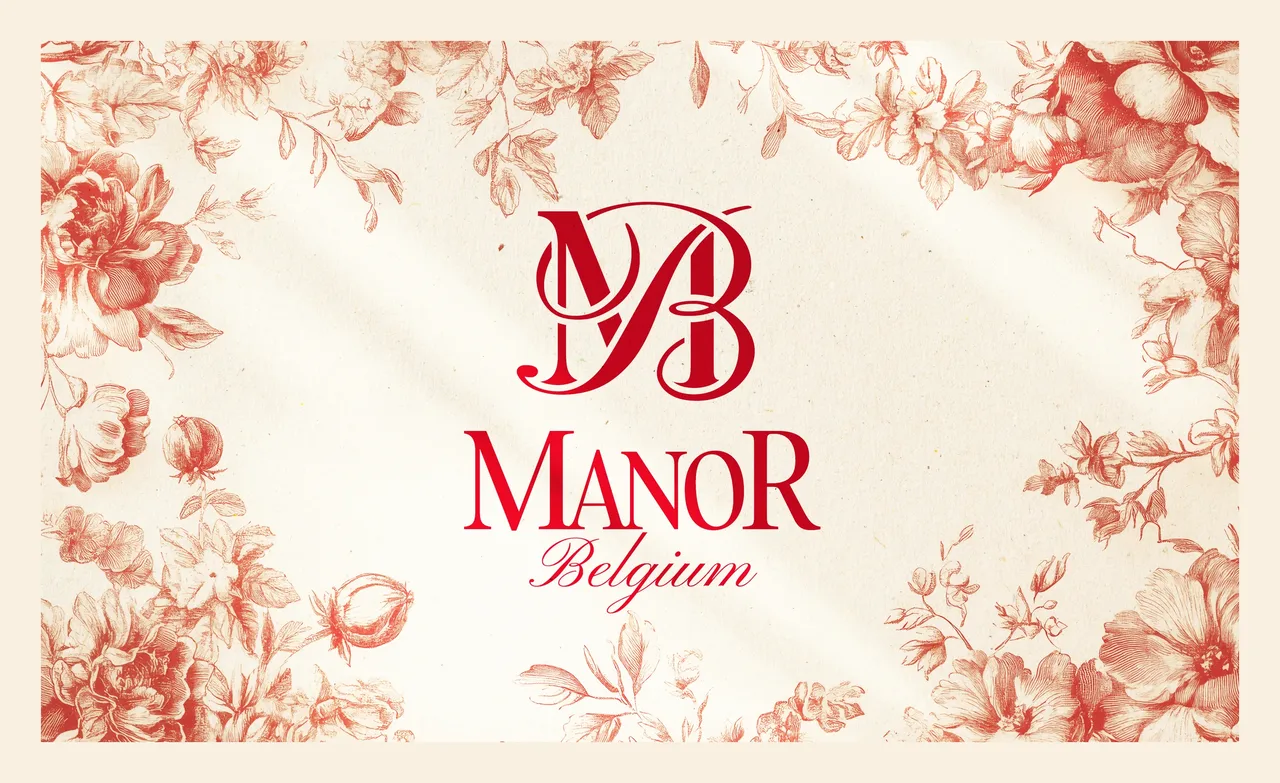
The MB monogram is drawn like a precious piece of calligraphy, taken from old coats of arms and family houses. It plays on two things at once: MANO, the hand and human craft, and gold. But it does not stop at the screen. It is pressed into wax on the packaging, at the moment of unboxing. That decision holds the rest of the system together: a palette of ruby red, patinated gold and deep browns that quietly revisits the Belgian flag, a shape borrowed from manor doors that works as a frame, and three typefaces, one of them a calligraphy reserved for the single word Belgium.
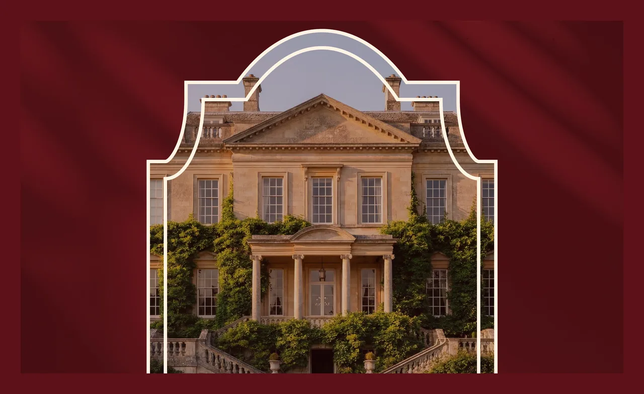
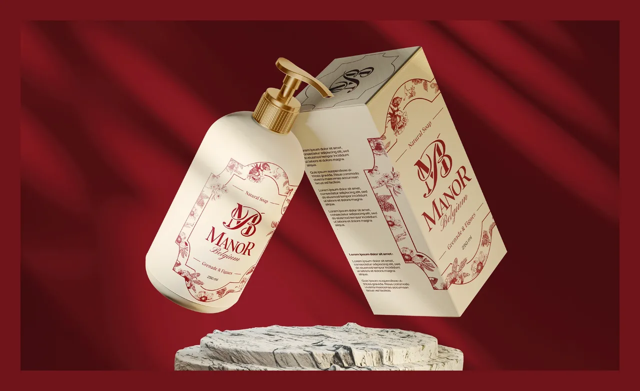
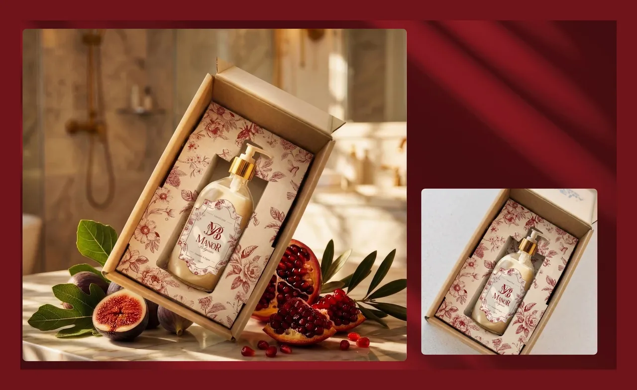
The product sits on a worktop, so it is seen close up and for a long time. The glass bottle, the box and the wax seal are the first contact, before any advertising: that is where the brand has to prove a washing-up liquid belongs next to the objects you keep. The pattern and the manor-door shape act as a shared frame across the three references, which makes them read as a collection rather than three products in a row.
- Brand identity and monogram
- Packaging and wax seal
- Website, currently in progress
Before, during, after: the same method on every project
See our expertise · Art Direction, Branding & Naming Let's talk about your project- Before
Discovery
We get to know the project, ask our questions and talk it through with you.
- Before
Inspiration and direction
We gather inspiration and set a direction with you, before anything gets created.
- During
Creation
The heart of the project, paced by regular back and forth with you.
- After
Delivery and testing
We deliver, then check with you that everything works.
- After
Handover and adjustments
We train you and help you get to grips with the material. Your feedback is taken on board to fine-tune it.