Artisanat de Saba
Brand identity
Artisanat de Saba is a brand of Ethiopian artisanal products: oils, spices, tea, honey. It had to hold two promises at once, rarity and authenticity on one side, a quiet elegance on the other, without ever falling into decorative exoticism. The principle is set on the first page of the brand book: luxury and tradition are not opposites, they meet in selection, precision and sincerity.
- Client
- Artisanat de Saba
- Role
- Brand identity
- Year
- 2025
The original brief was about packaging. On opening the file, the existing logotype proved too weak to carry it: it lacked legibility and character, and dressing dozens of references with it would only have spread the problem. The studio therefore proposed widening the scope to the identity itself, rather than executing a brief whose limit it could see. It is a textbook case of what vdb creation often does: answer the brief that was set, and flag the one that should have been.
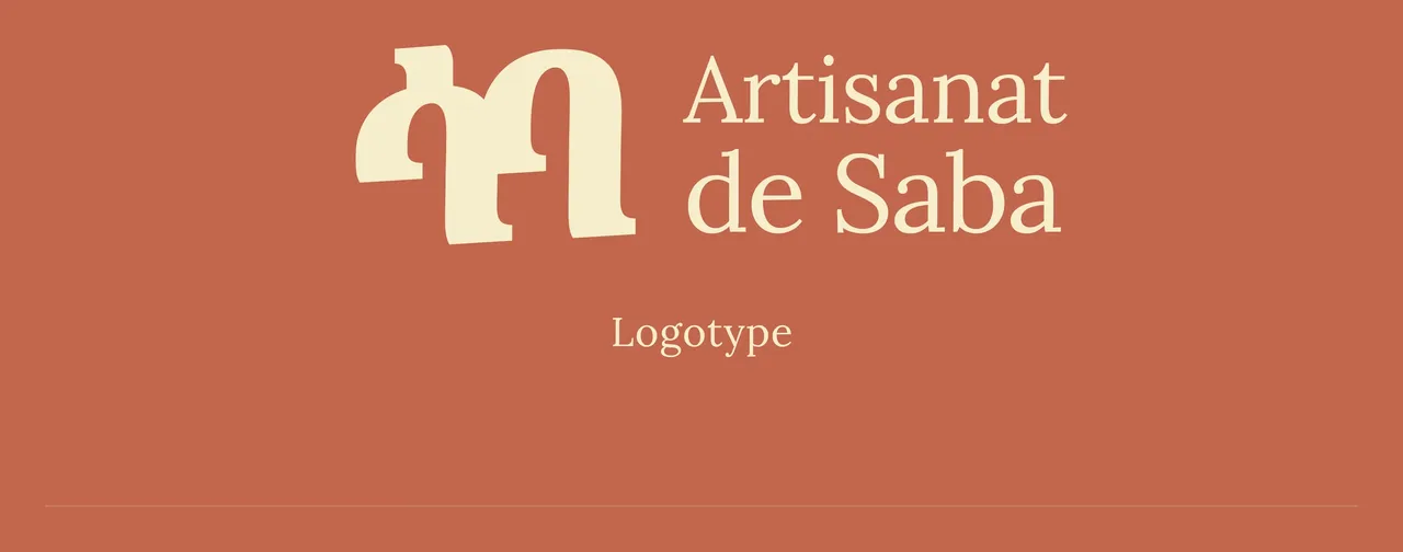
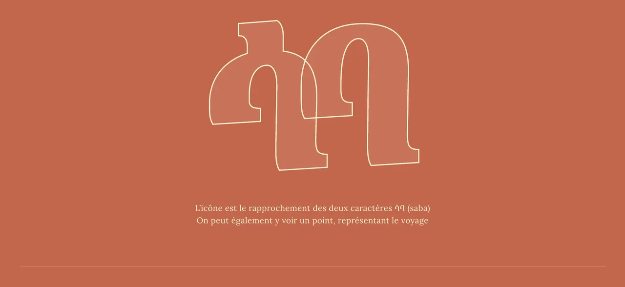
The name written in Amharic becomes the icon
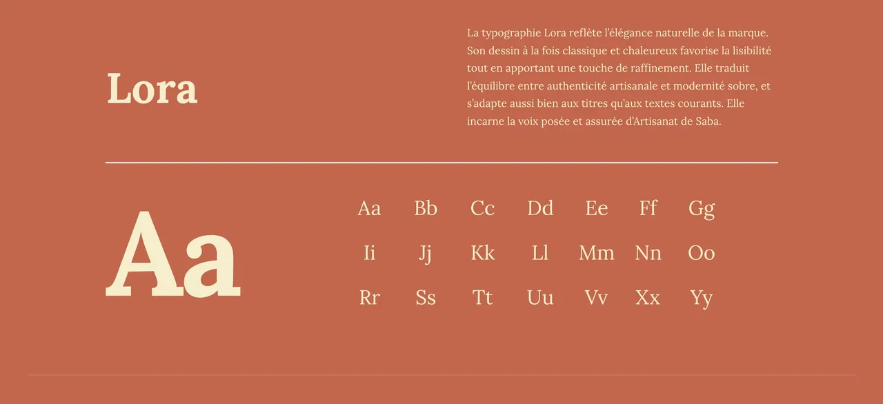
The logotype pairs an elegant typeface with a symbol drawn from the Amharic alphabet. The icon is the joining of the two characters that read Saba: the brand's name written in the script of its own country, not an abstract shape loosely inspired by it. It can also be read as a dot, standing for the journey. Everything else follows the same logic of rootedness. The primary colour is warm and mineral, it evokes the soil; ten tertiary tones carry the real diversity of the range, leaves, seeds, bark, oils and natural pigments; and Lora, a classic, warm serif, carries the brand's steady voice.
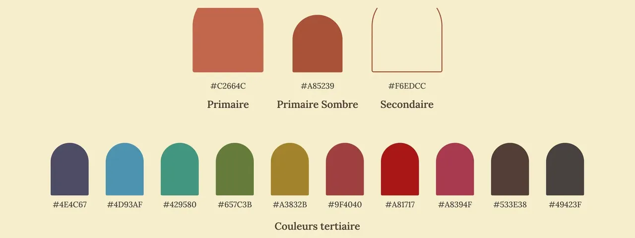
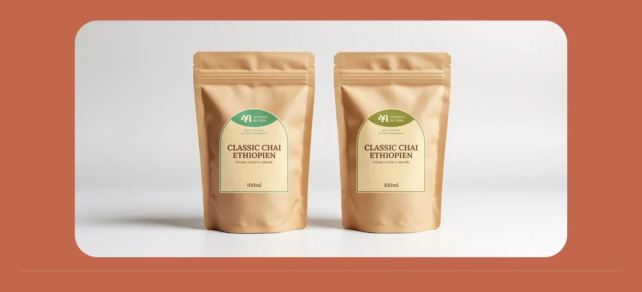
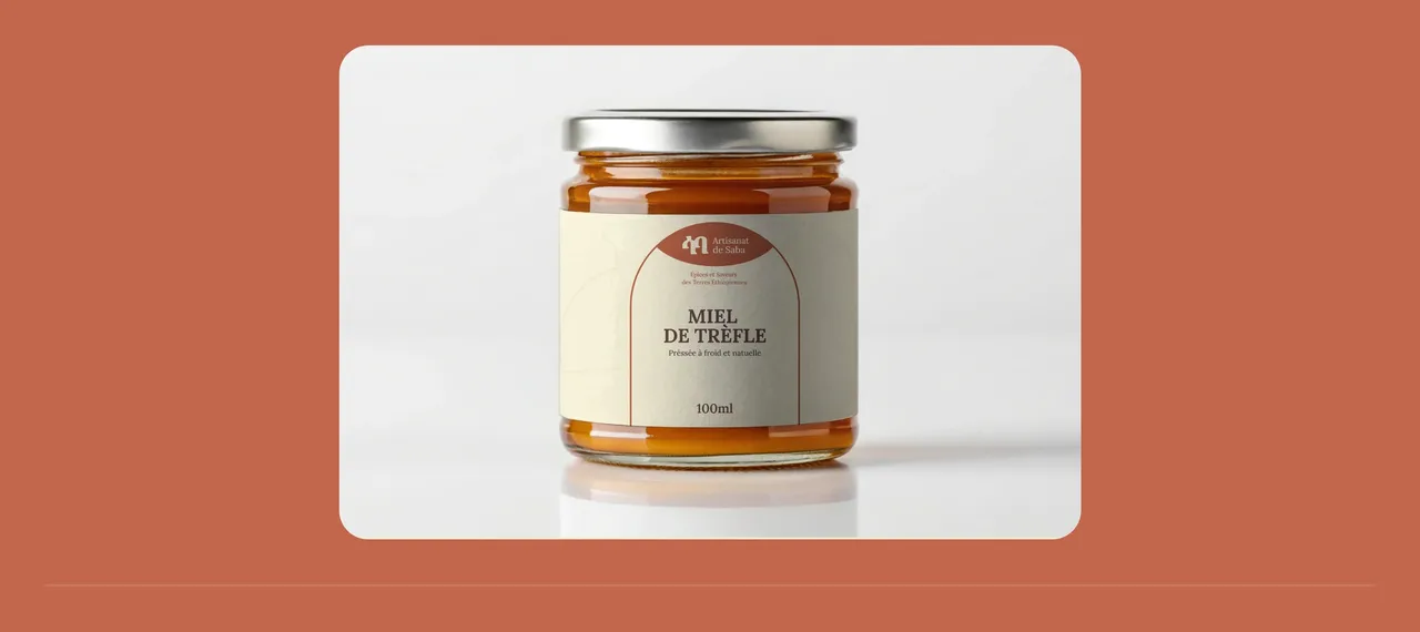
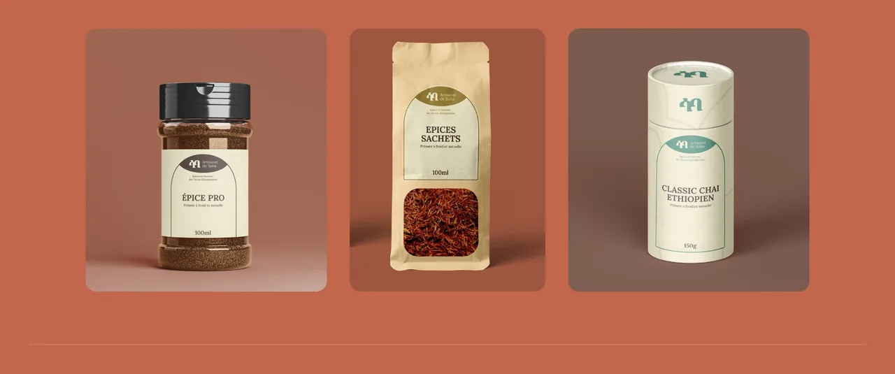
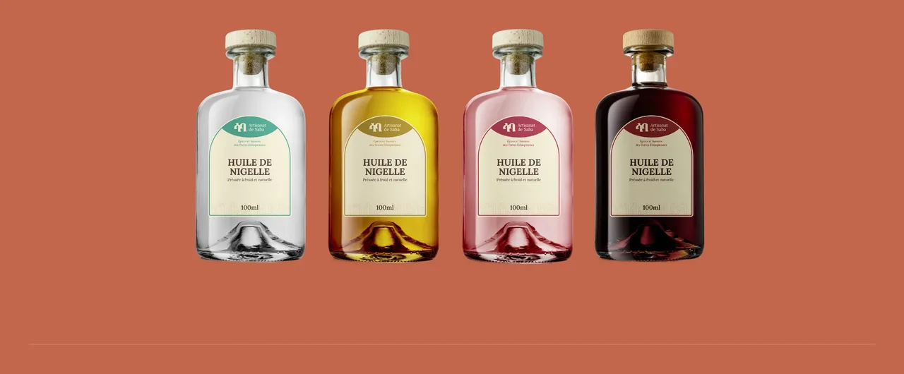
The ten tertiary tones find their use on the packaging, where each product family gets its own: the oil bottles, the spice and tea pouches, the honey. That is what tells one reference from another on a shelf without multiplying logos, and lets a new product be added later without reopening the guidelines. The shop window applies the same restraint: the mineral colour holds the background, the Amharic logotype stays the only sign, and the products do the rest of the work.
- Full brand identity modernisation
- Logotype and icon drawn from the Amharic alphabet
- Dozens of packaging designs, across every range
A brand system that produces labels
- labels generated from a single product spreadsheet
- 72
- products labelled, from spices to honey
- 34
- pages of brand guidelines
- 15
Counted on 28/09/2026 in the project files
Before, during, after: the same method on every project
See our expertise · Art Direction, Branding & Naming Let's talk about your project- Before
Discovery
We get to know the project, ask our questions and talk it through with you.
- Before
Inspiration and direction
We gather inspiration and set a direction with you, before anything gets created.
- During
Creation
The heart of the project, paced by regular back and forth with you.
- After
Delivery and testing
We deliver, then check with you that everything works.
- After
Handover and adjustments
We train you and help you get to grips with the material. Your feedback is taken on board to fine-tune it.