The old Romanian restaurant in central Brussels has its regulars and it works very well. What had aged was its image, and its name. So the project started by renaming it, then remade everything you can see: the lettering, the menus, the site.
- Client
- Vallée du Ciel
- Role
- Name, brand identity, menus and website
- Year
- 2025
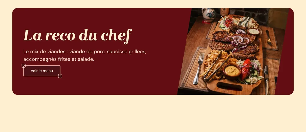
It is the oldest Romanian restaurant in Brussels, and it had no shortage of customers. What it had was a perception problem, because the house was worth more than its shopfront and its printed matter suggested. The work was therefore run as a full rebrand rather than a website redesign, going all the way down to photographs of the dishes, which did not exist in any usable quality.
A name written by hand, an identity built like postcards
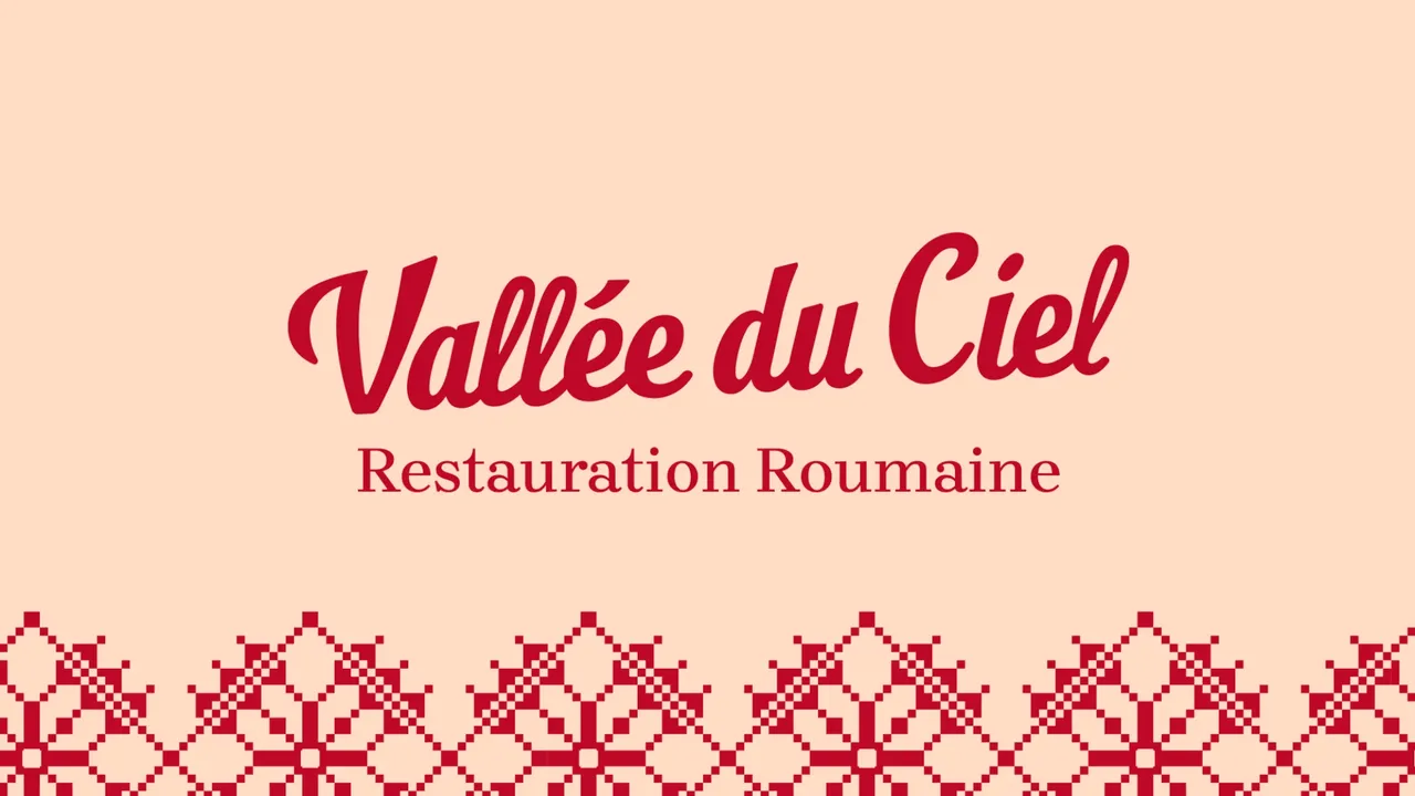
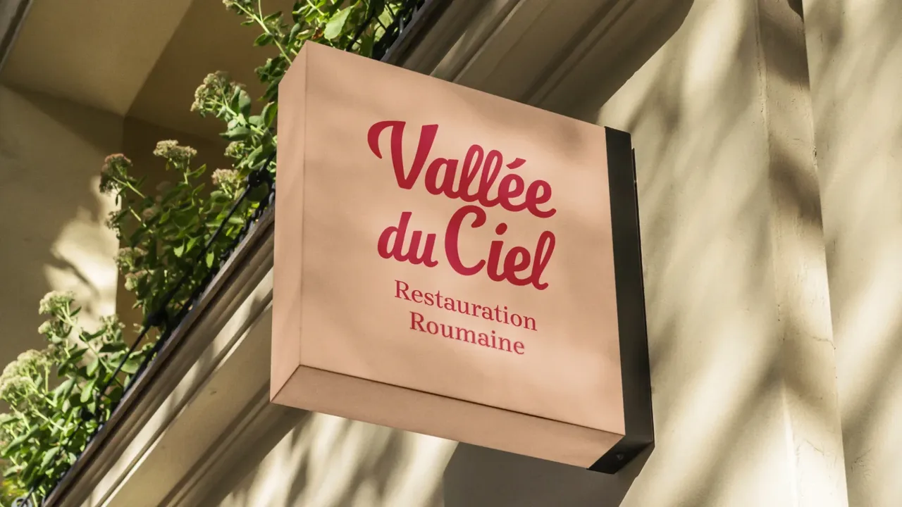
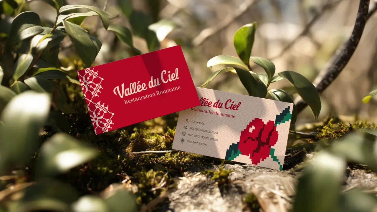
Vallée du Ciel is written by hand, in a traditional script that says where the house comes from. Everything else follows from that: the identity is built as a series of paintings and postcards recalling the home town of Carmen, the owner who founded the place. The menus were entirely remade, with traditional Romanian motifs and visual adaptations that belong to the country rather than to restaurant decor. The blend is always the same one: modernity laid over tradition, never the other way round.
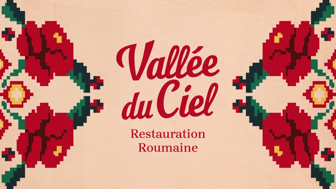
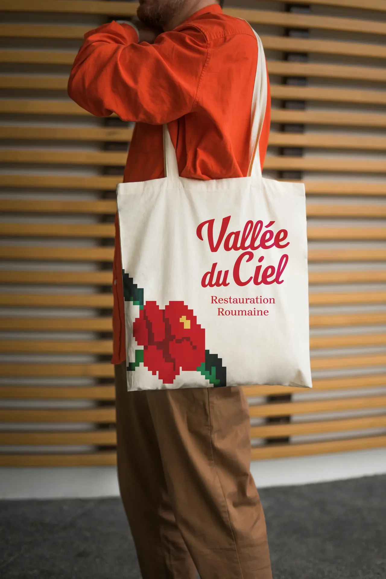
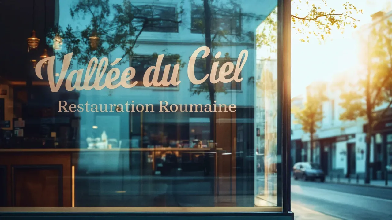
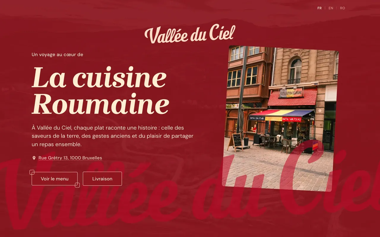
The identity does not stop at the screen. It carries onto the sign, the window, the cards and the tote bag, and that is where a handwritten name is really tested: it has to stay legible large on a façade and small at the foot of a menu. The traditional patterns tie those surfaces together without ever becoming decoration that would smother the food. A restaurant is looked at from the pavement before it is read at the table.
- New name and hand-drawn identity
- Website aligned with the art direction
- Full menus, traditional patterns included
- Photography of the dishes and the room
- Business cards
- Shop window visuals and signage
The site in numbers
- languages on the site: French, English, Romanian and Dutch
- 4
- dishes and drinks on the online menu, in French, English and Romanian
- 125
Measured on 28/09/2026
Visit vallee-du-ciel.be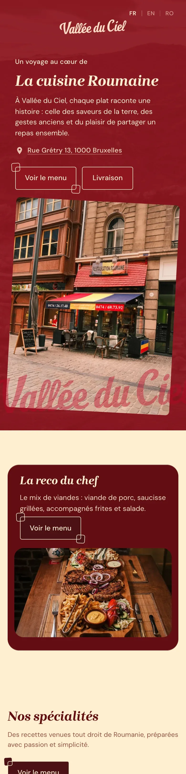

Before, during, after: the same method on every project
See our expertise · Art Direction, Branding & Naming Let's talk about your project- Before
Discovery
We get to know the project, ask our questions and talk it through with you.
- Before
Inspiration and direction
We gather inspiration and set a direction with you, before anything gets created.
- During
Creation
The heart of the project, paced by regular back and forth with you.
- After
Delivery and testing
We deliver, then check with you that everything works.
- After
Handover and adjustments
We train you and help you get to grips with the material. Your feedback is taken on board to fine-tune it.