Contact Max
Brand identity
Contact Max is a new radio station in the Radio Contact group, at RTL Belgium. The constraint fitted in one sentence: the logo had to work inside a brand universe that already existed. Not build a new one beside it, and not dissolve into it either.
- Client
- RTL Belgium · Radio Contact
- Role
- Brand identity
- Year
- 2025
Produced in-house at RTL Belgium.
RTL Belgium launches a little sister to Radio Contact, devoted to the music of the eighties, nineties and two-thousands. A new station, but not an independent one: it had to introduce itself as a family member, recognisable at a glance as part of the group, while carrying the energy of its own programming. All the work happened in that narrow gap, between the heritage to respect and the personality to establish.
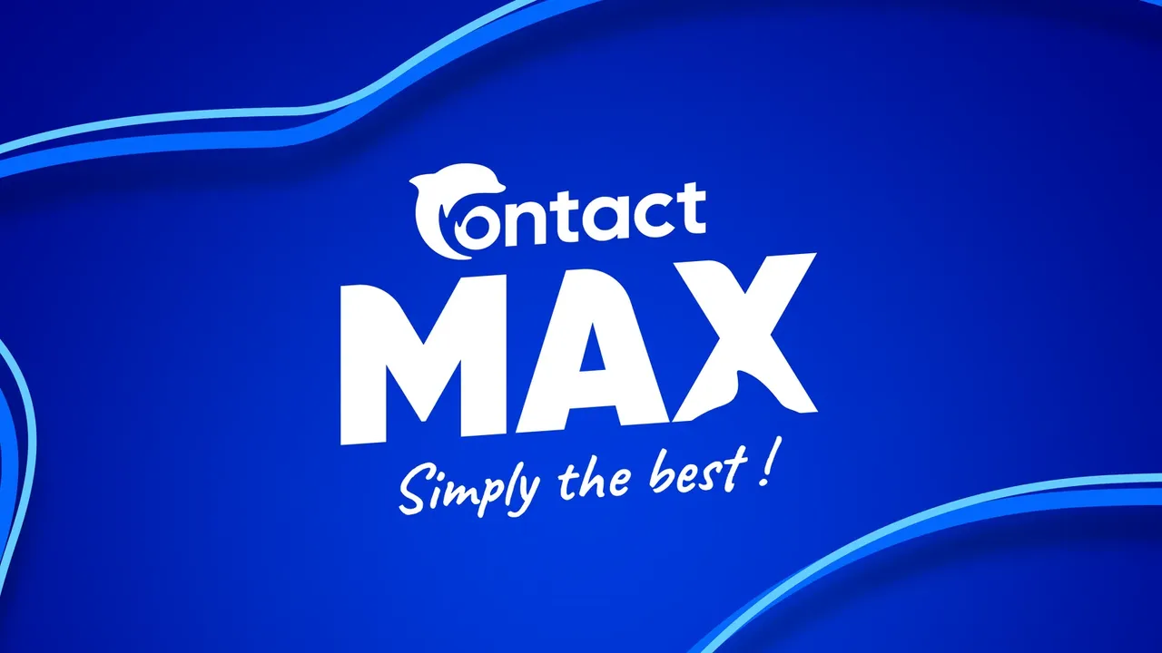
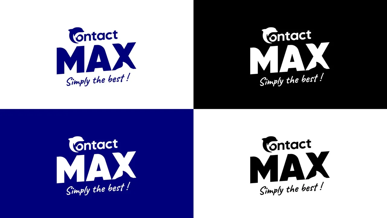
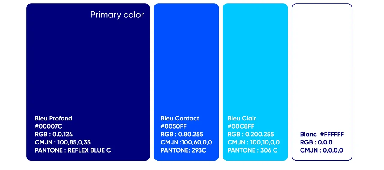
Everything comes from Radio Contact, except four degrees
The guidelines say it on their cover: this branding is derived from Radio Contact's. The dolphin does not move, it stays lodged in the C of Contact, and the three blues are the parent brand's, from Deep Blue to Light Blue. What belongs to Max is the word itself, set in very bold Gilroy, and the handwritten baseline in Caveat. Both are placed with the same reproducible rule, a four degree tilt and a slight skew, and that is enough to make a livelier station audible without leaving the family. It reads as very little, and that is exactly the job: the new station has to be recognisable at first glance, and belong to the group at second glance.
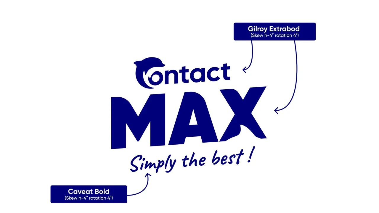
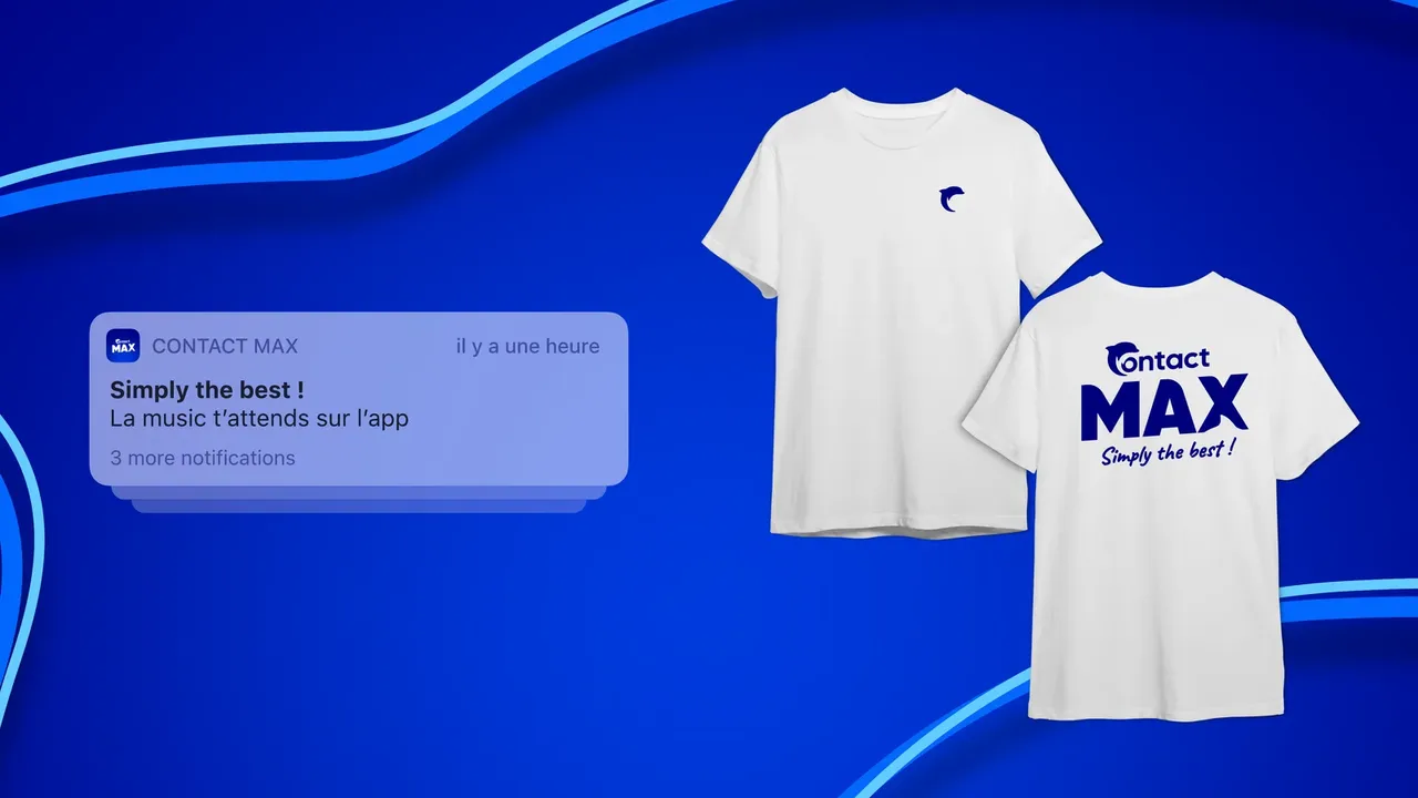
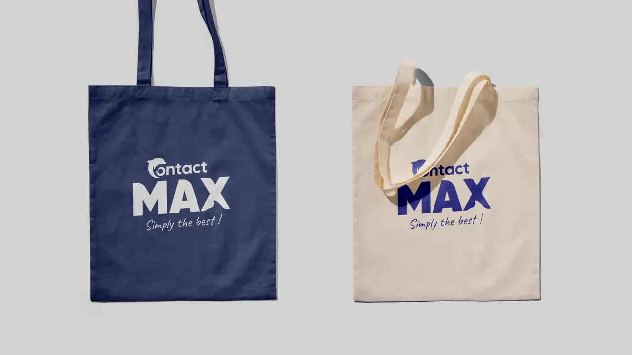
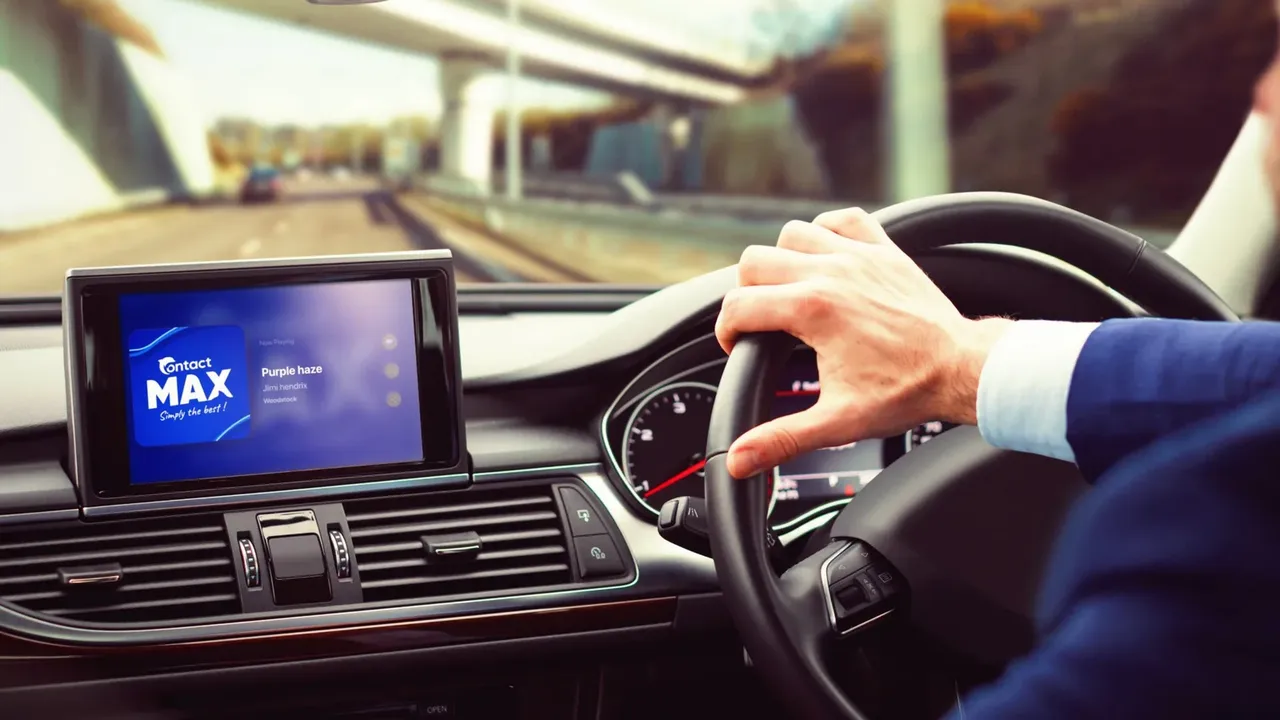
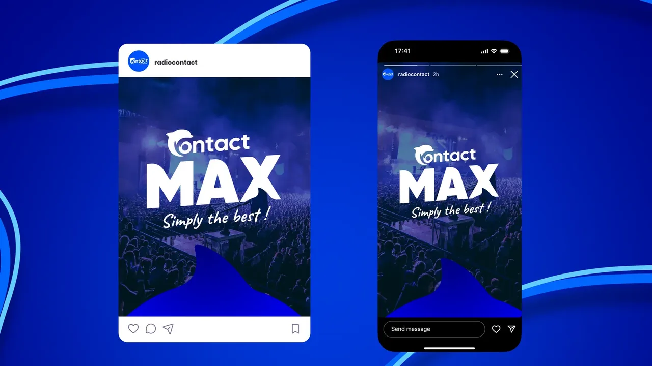
A radio station is seen mostly off air, and that is where the derivation gets tested. The logo runs on social media, on a t-shirt, on a tote bag and on the station car: four settings where it sits alongside the group's other brands, sometimes side by side. Each time the same question, is Max recognised without hesitation, and is it clear it belongs to Radio Contact. The four-degree tilt answers both, and no application needed an exception.
On air since 13 February 2025
Contact Max has been on air since 13 February 2025, on DAB+ and digital, under this logo. It opens the official launch press kit, still available on dossiersdepresse.be.
Before, during, after: the same method on every project
See our expertise · Art Direction, Branding & Naming Let's talk about your project- Before
Discovery
We get to know the project, ask our questions and talk it through with you.
- Before
Inspiration and direction
We gather inspiration and set a direction with you, before anything gets created.
- During
Creation
The heart of the project, paced by regular back and forth with you.
- After
Delivery and testing
We deliver, then check with you that everything works.
- After
Handover and adjustments
We train you and help you get to grips with the material. Your feedback is taken on board to fine-tune it.